


NoteThis case study includes designs, research findings, and internal decisions. Sensitive images are blurred or omitted to respect client privacy.
Overview
GM Energy's first step into ecommerce, taking their home energy management system (HEMS) line from no digital presence to a launched, financed, installable commerce experience, and building the research practice that keeps improving it.
Impact
- Took GM Energy from zero to a launched commerce experienceDefined what the experience should be: service blueprint, personas, journeys. Then carried it through wireframes, sprint delivery, and launch: configurable bundles, financing inside checkout, installation scheduling, and account management.
- Unified purchase, financing, and installation into one checkoutTook what began as a hand-off between GM Energy, GM Financial, and the install partner and integrated it into a single flow: purchasing the products, financing them with installation, and quoting the install in one process, so the customer is never passed back and forth. One of the hardest problems in the project, and it took many iterations to get right.
- Established the research framework for validation testingEvery study still starts from the frame I set: what we're asking, why, what the result should tell us, and how the answer drives the design decision. I guided our senior UX designer through the first studies, then partnered on testing and synthesis as the practice matured into the process the team runs today.
The major tracks
One engagement with several workstreams running at once, from 2022 through launch and after.
The challenge
In fall 2022, home energy management systems were an emerging category and GM was entering it for the first time. There was no ecommerce presence, no established journey, and no agreed definition of who the customer was.
It started as a service design engagement with four goals: define how GM Energy should engage with and serve its customers; work out which systems, platforms and processes that would take; show the future state through concepts and prototypes; and produce the roadmap for building it.
Research: understanding the ecosystem and the product line
We started by learning two things: what GM Energy was offering across its product line, and how competitors were approaching the space. I visited GM dealers, competitor EV dealerships and home generator dealers to see how home backup power actually gets sold. Between that and desk research we found GM was in an unusual position: the only company selling both EVs and home battery systems, with Tesla's EV-plus-Powerwall lineup as the only direct competitor.
That fed a categorization exercise: mapping the emerging HEMS products against the customers most likely to want each one. It turned a catalog of chargers, storage and backup hardware into a map of who each product is for, which everything downstream built on. Service design workshops ran throughout the project. I built everything they ran on: the personas, the sitemap, the blueprint. I also ran follow-up sessions to validate it, while our director facilitated the on-site client workshops.
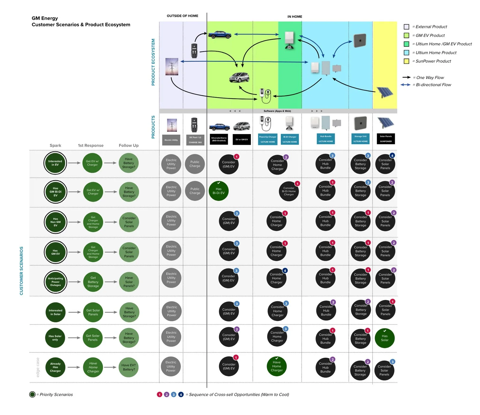
The service blueprint
My strategy was to build a big-picture understanding of the customer experience, not just the website. I never focused on one part of it; I wanted everything before and after understood, so we knew what the experience was outside GM Energy too: before a customer ever reaches the site, and after they leave it. The other half of the strategy was guidance. Nobody had shopped this category before, so the experience could not assume the customer knows the next step. Every part of it was designed to lead: the site walks them from learning to purchase, checkout carries quoting and financing in one flow, Genie guides the undecided, and the sales guide gives consultants the same journey to walk a customer through.
Beyond driving immediate conversions, our strategic vision was to establish GM Energy as the definitive 'source of truth' for Home Energy Management Systems (HEMS). By creating a robust repository of educational content, FAQs, and interactive guides, we designed a platform that anchors the brand as a trusted industry authority. This top-of-funnel educational strategy ensures that even if a consumer is merely researching HEMS viability, GM Energy becomes their primary psychological benchmark, maximizing long-term brand equity and top-of-mind awareness.
I created the blueprint from research and stated assumptions. It was then taken to a workshop with GM to validate it further and make it more accurate.
Nobody had mapped this category yet, so waiting for solid data would have stalled the project. We wrote our assumptions down instead and kept going, treating the blueprint as a living document. Each assumption was tested with usability studies and surveys, starting with the riskiest, and we folded in new research as it arrived, the audience segmentation especially, which either confirmed what we'd sketched or overturned it.
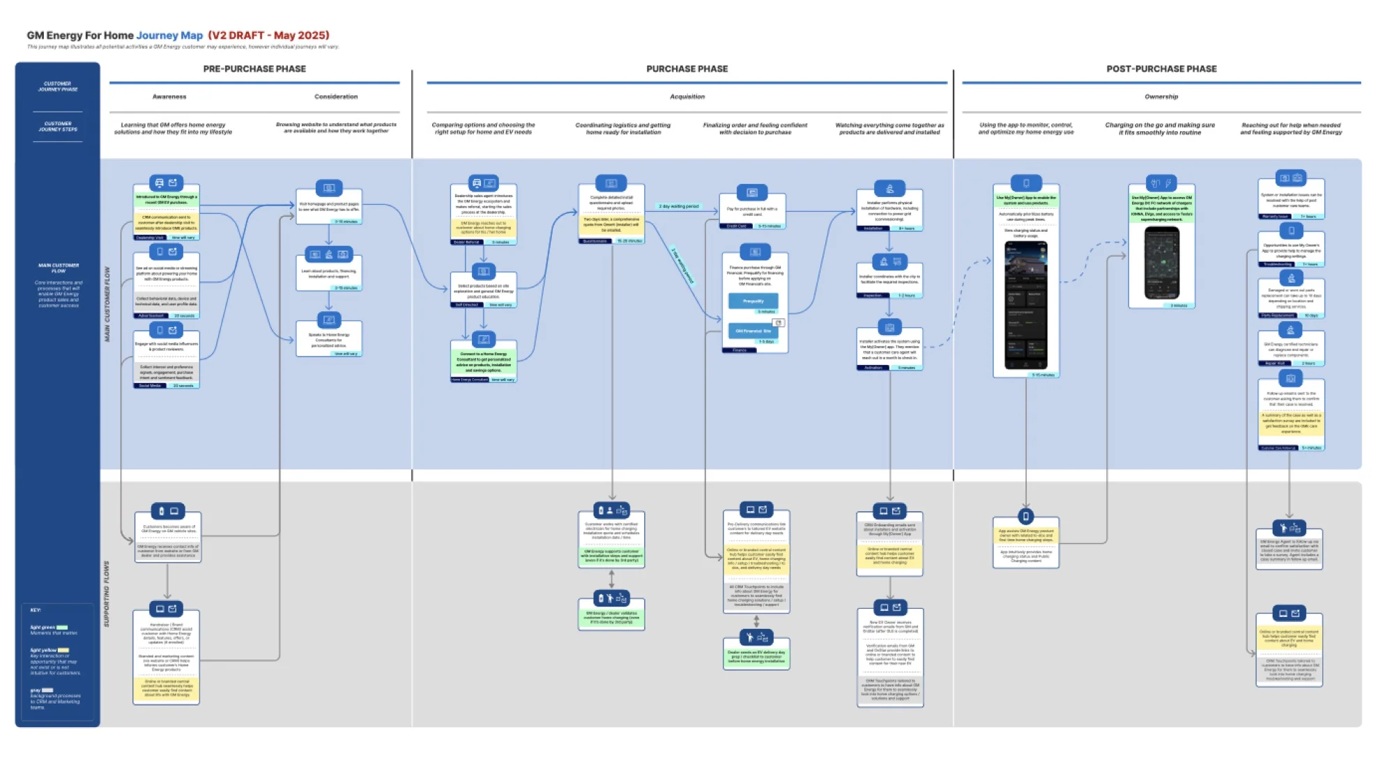
What it became was a large end-to-end service blueprint covering the full lifecycle: learn, shop, buy, install, own. For every customer step it mapped the touchpoints, the frontstage staff actions, and the backstage machinery: which teams, which platforms, which support processes had to exist for that moment to work. For a company standing up commerce, an installer network, and financing all at once, the blueprint became the shared reference for what had to be built, and we kept revising it for years as the real product took shape.
On the commerce journey alone we mapped 67 potential moments across 12 touchpoints, 46 of the features that came out of it went into the approved 2024+ roadmap, and more than 23 usability tests have been run against it. We built parallel maps for public charging (36 moments) and post-purchase care (35 moments).
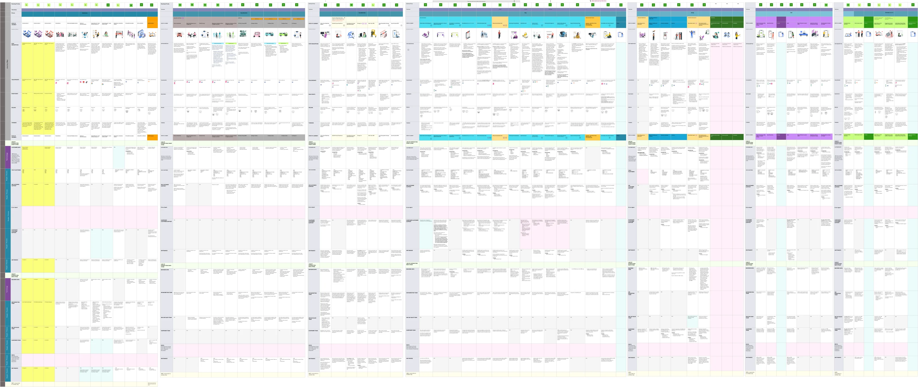
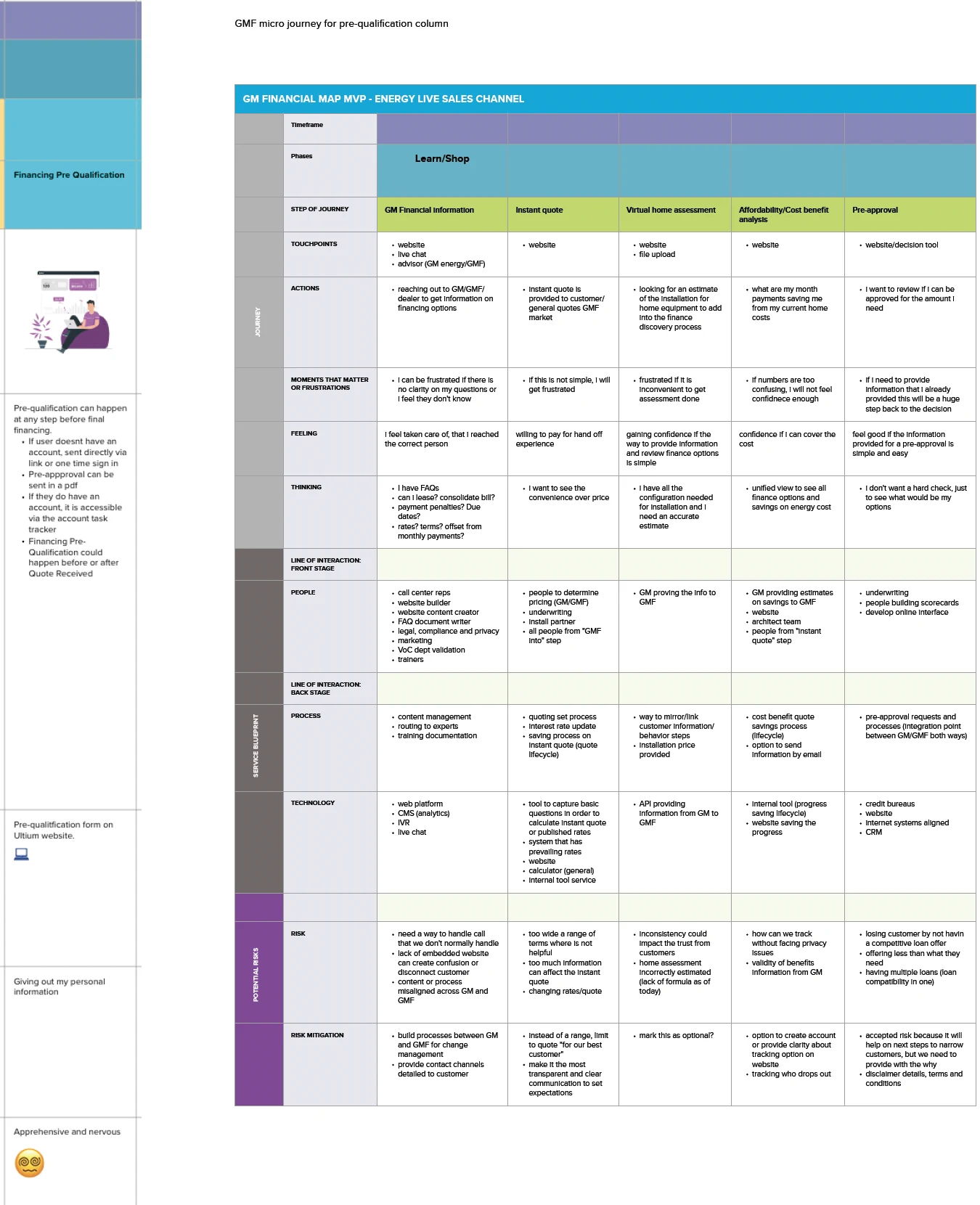
The blueprint let us pick out columns and detail them into experiences, even as we delivered the website.
Financing pre-qualification is one column on the master blueprint. Detailed out, it becomes its own micro journey: five steps from GM Financial information through pre-approval, each with its own touchpoints, feelings, the people and systems behind it, and the risks to design against.
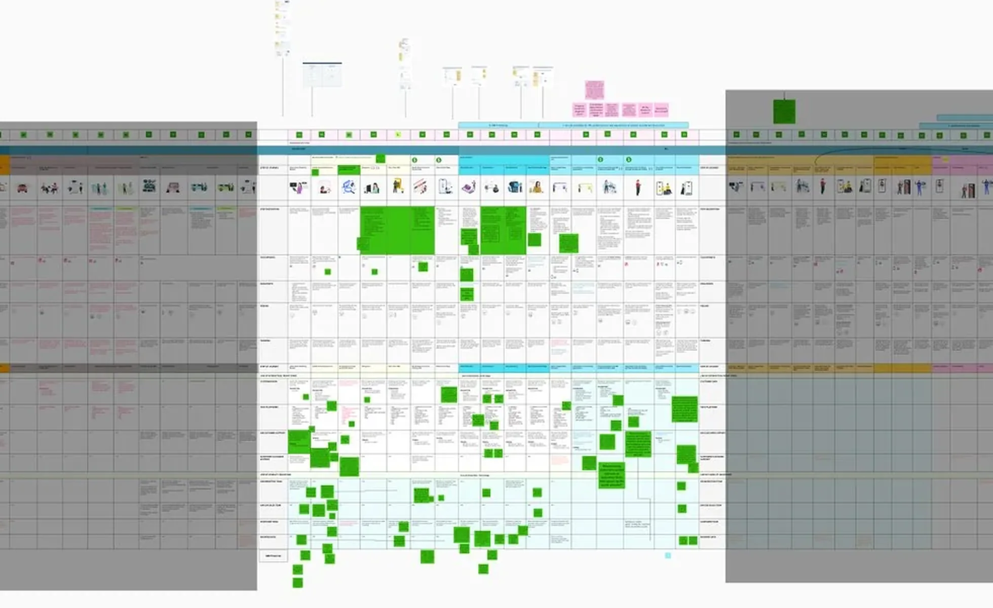
We needed to focus on what the website should be, so I highlighted the section of the blueprint where the customer lands to learn, shop and purchase the product, the main focus of the site. From those columns we created journeys for each persona, to understand what each customer type needed.
Who we designed for
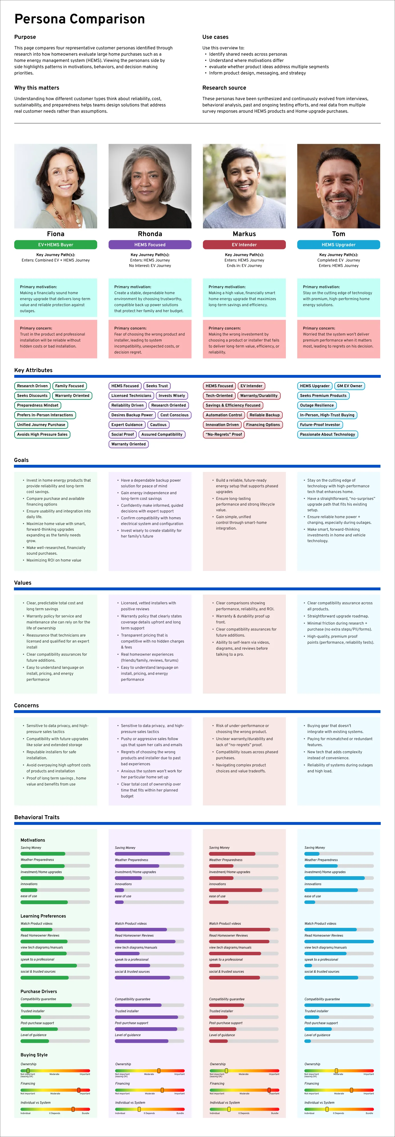
 Tech BuilderMarkus
Efficiency-minded project manager, frustrated by outages. Wants visibility and control over home energy, considering an EV.
 Shiny EliteTom
Finance executive and GM EV owner who wants the best of the best: premium products, reliable through blackouts.
 Smart TechFiona
Research-driven Lyriq owner weighing solar and backup power. Values usability, warranties, and the best possible deal.
 Smart & SafeRhonda
Educator nearing retirement in blackout-prone Florida. Wants dependable backup power and expert guidance, no EV interest.
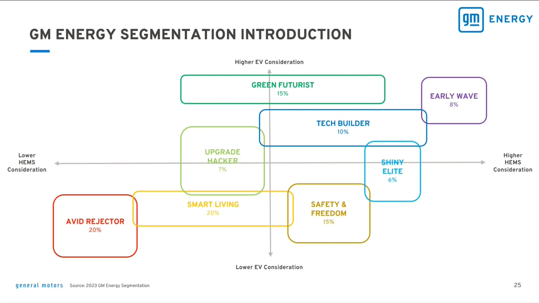
We created the first personas from the closest customer types that already existed: solar buyers and backup-generator owners, the people most likely to resemble a HEMS customer.
To validate our assumptions we then gathered stakeholder interviews and secondary research, which resolved them into three EV-centric archetypes: Markus (electro-curious), Tom (Sierra EV buyer), and Fiona (other EV buyers). Segmentation research validated them further. A GM Financial journey workshop added Voice-of-Customer personas that pushed us to consider financing behavior explicitly.
Early on we also discovered a group we hadn't accounted for: people who want home energy security because extreme weather keeps knocking their power out, and who have no interest in an electric vehicle at all. That became Rhonda, and for a company built around vehicles it mattered beyond the design: the energy business had customers who would never arrive through vehicle sales. That gave us the four personas we needed to build journeys specific to each one.
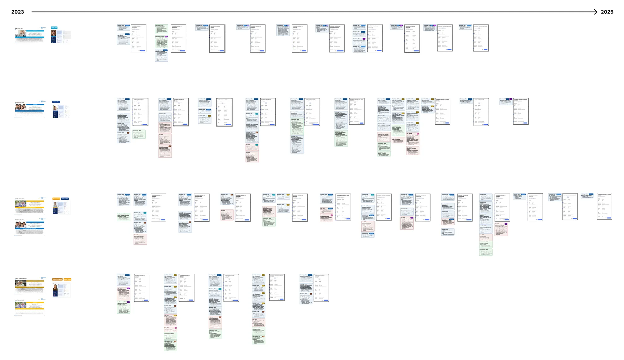
Throughout the project we kept refining them against evidence. We pulled sentiments out of every usability study run since May 2023, sorted them by knowledge, cost and concerns, grouped the real test participants, and built new attribute charts from what those people had actually said, evolving them into an intimate understanding of who our customers are.
The personas map straight onto the segmentation above: Markus and Tom to a single segment each: Tech Builder and Shiny Elite. Fiona and Rhonda are blends: Smart Living + Tech Builder, and Smart Living + Safety & Freedom.
Every decision was made with these personas' goals in mind, and we shared them with the whole team and the client. They also went into the sales guide, so home energy consultants could keep each customer's goals and concerns in mind while guiding the conversation.
Understanding the customer journey
Working through the four personas produced three journeys: HEMS, EV, and a combined one for customers buying both together. Some personas share a journey but enter and leave at different points; some cross from one into another partway through.
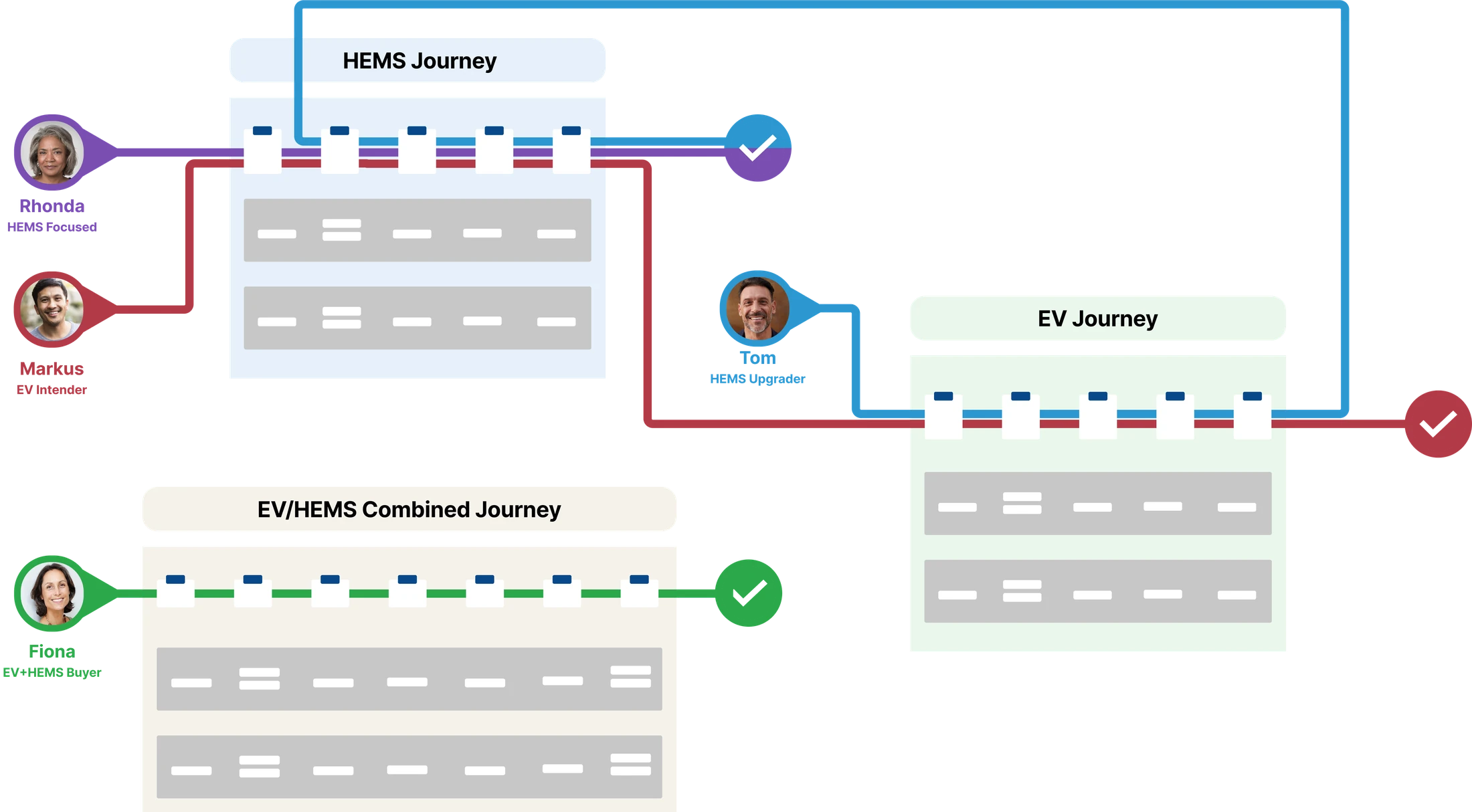
Where the purchase opportunities sat depended on where the customer started. Although the blueprint shows us all the steps, depending on the customer they may not touch every column. The three journeys we produced detail how each persona may enter or leave the flow.
TomHEMS UpgraderTom recently purchased a Cadillac Escalade IQ and completed the EV Journey. Now interested in a GM Energy Home system, he crosses over and enters the HEMS Journey through app onboarding, an owner who wants his home to keep up with his vehicle.
MarkusEV IntenderTom's mirror image. Markus is completing the HEMS Journey for the purchase of a GM Energy Home System, and has decided to purchase a Silverado EV, entering the EV Journey next.
RhondaHEMS FocusedRhonda is only interested in purchasing the GM Energy Home System and completes the HEMS Journey, start to finish. She never touches the EV path, the segment that proved the energy business isn't downstream of vehicle sales.
FionaEV+HEMS BuyerFiona completes the EV/HEMS Combined Journey to purchase a Blazer EV and GM Energy Home System together, buying both products at once, in a single linear path built specifically for her.
Site design
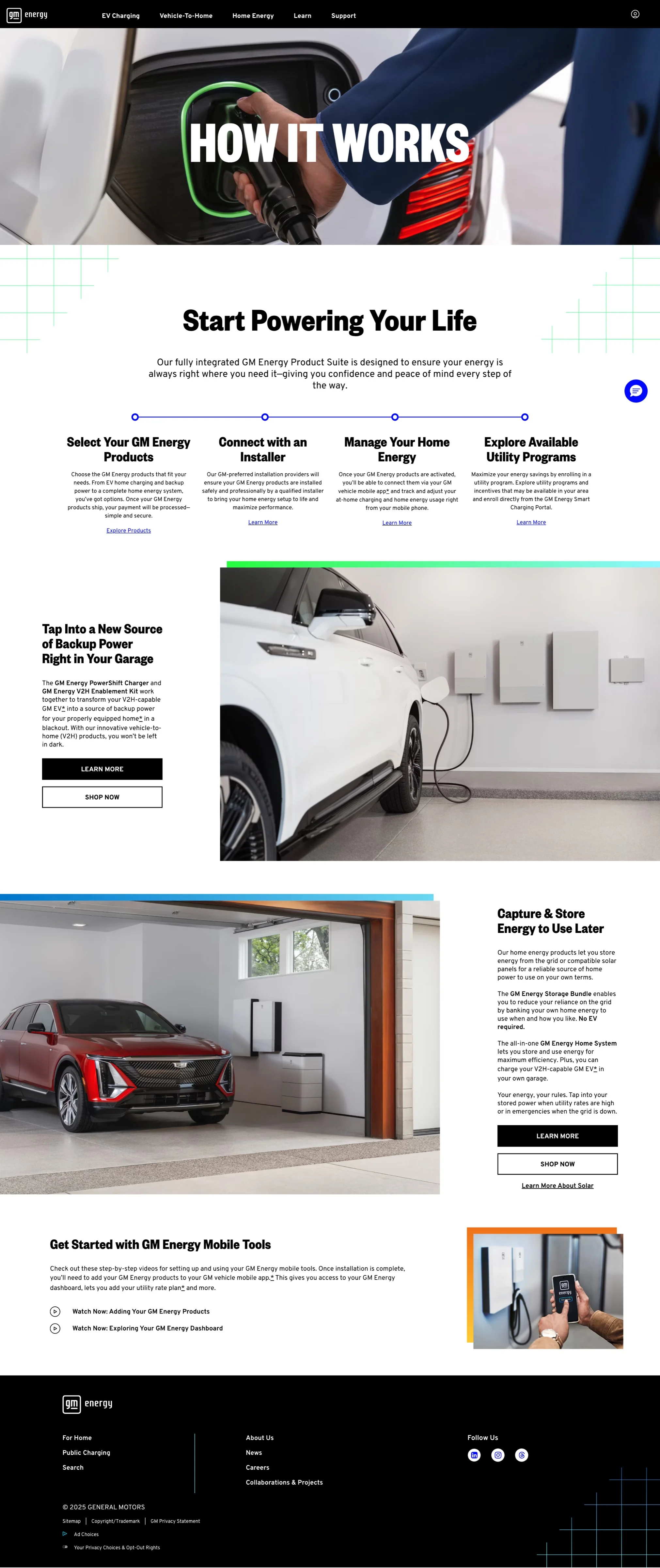
The GM Energy site needed to include education on Home Energy Management Systems (HEMS). Because these were being offered for the first time, we needed to explain the products, install process, and purchase flows.
From that structure I wireframed the site section by section, going deep on the pages that mattered most. The flows, and the content inside them, were shaped to support each persona's journey, what the blueprint and the journey maps had taught us each of them needed to learn, compare and decide.
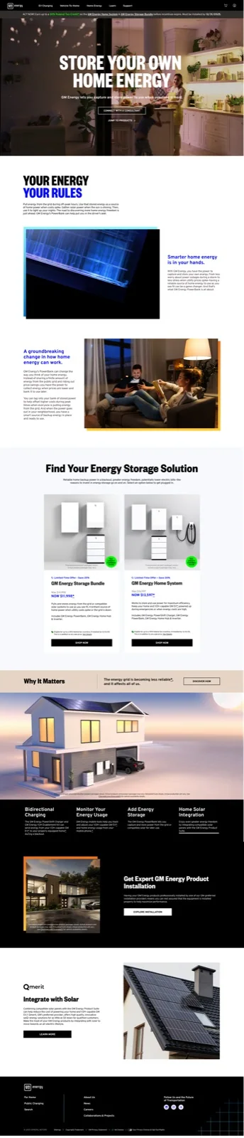
Education was an overarching theme for the site. The home page leads with video, a tabbed explainer that walks through each use case, and lifestyle imagery that shows how the products look and feel in a real home, so customers can picture them in their own. That education carries through the whole site, from the home page down to the product detail pages, moving from a high-level understanding to the details. The goal was for customers to imagine life with GM Energy and make the decision to own it emotionally, before price enters the picture. By the time they reach installation quoting and financing, the question is no longer whether they want it, it is how to arrange payment.
By teaching how it works instead of leading with specifications, the homepage shifts how people see an EV: not just transportation, but a power source for their home. Carrying that education through the whole journey lowers the barrier to a technology most customers have never shopped for.
- Simplifies complex systems. Vehicle-to-home backup power is broken into visual steps a customer can follow, so nobody gets overwhelmed.
- Contextualizes daily use. Specific scenarios, powering the home through a blackout or through peak grid hours, show the real-world value instantly.
- Builds buyer confidence. Installation, utility coordination, and hardware compatibility are explained up front, so those questions are answered before they can stall a purchase.
- Unifies the voice. The same informative tone runs across the homepage, product pages, and support content, so the whole site reads as one trustworthy source.
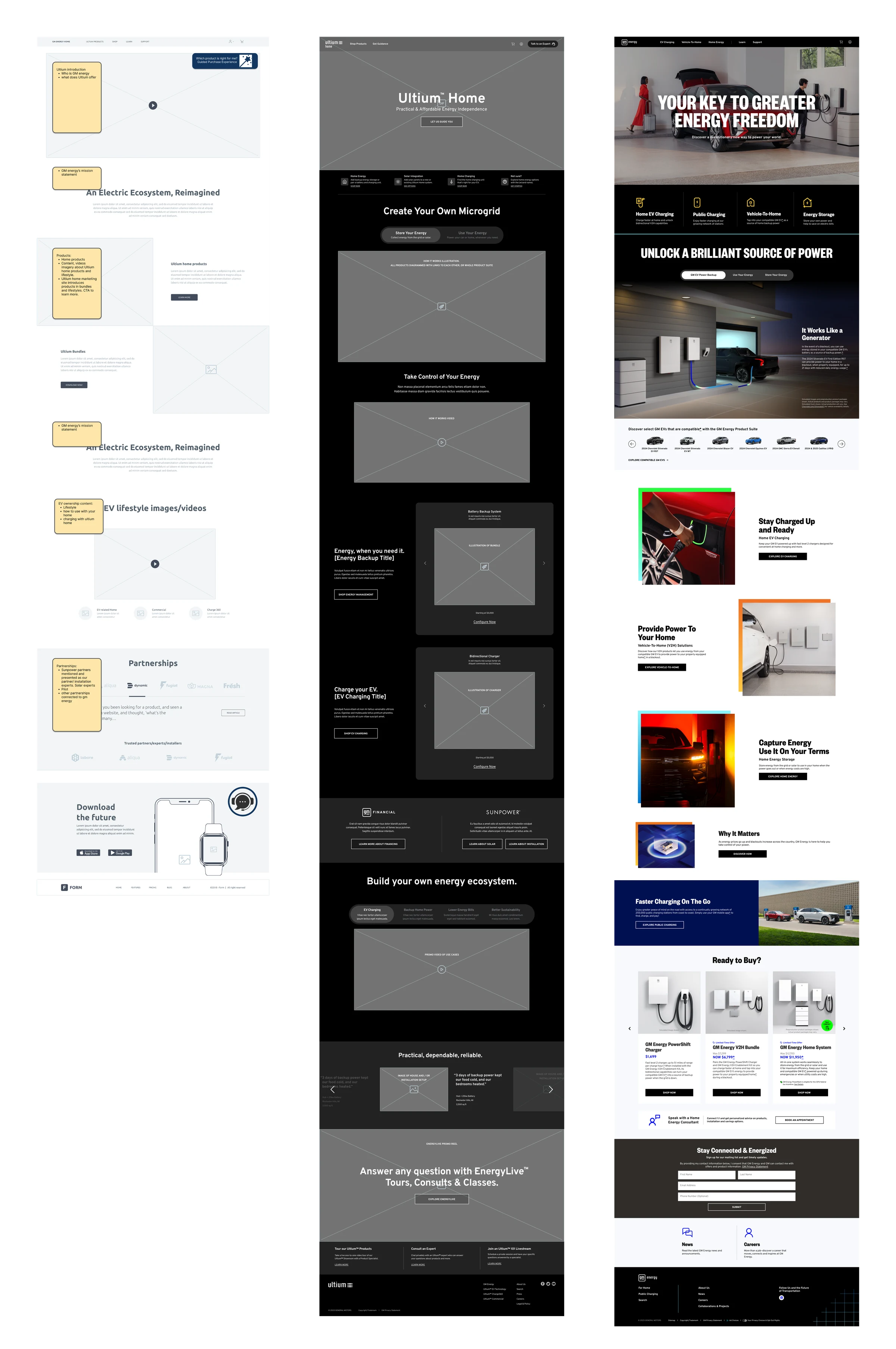
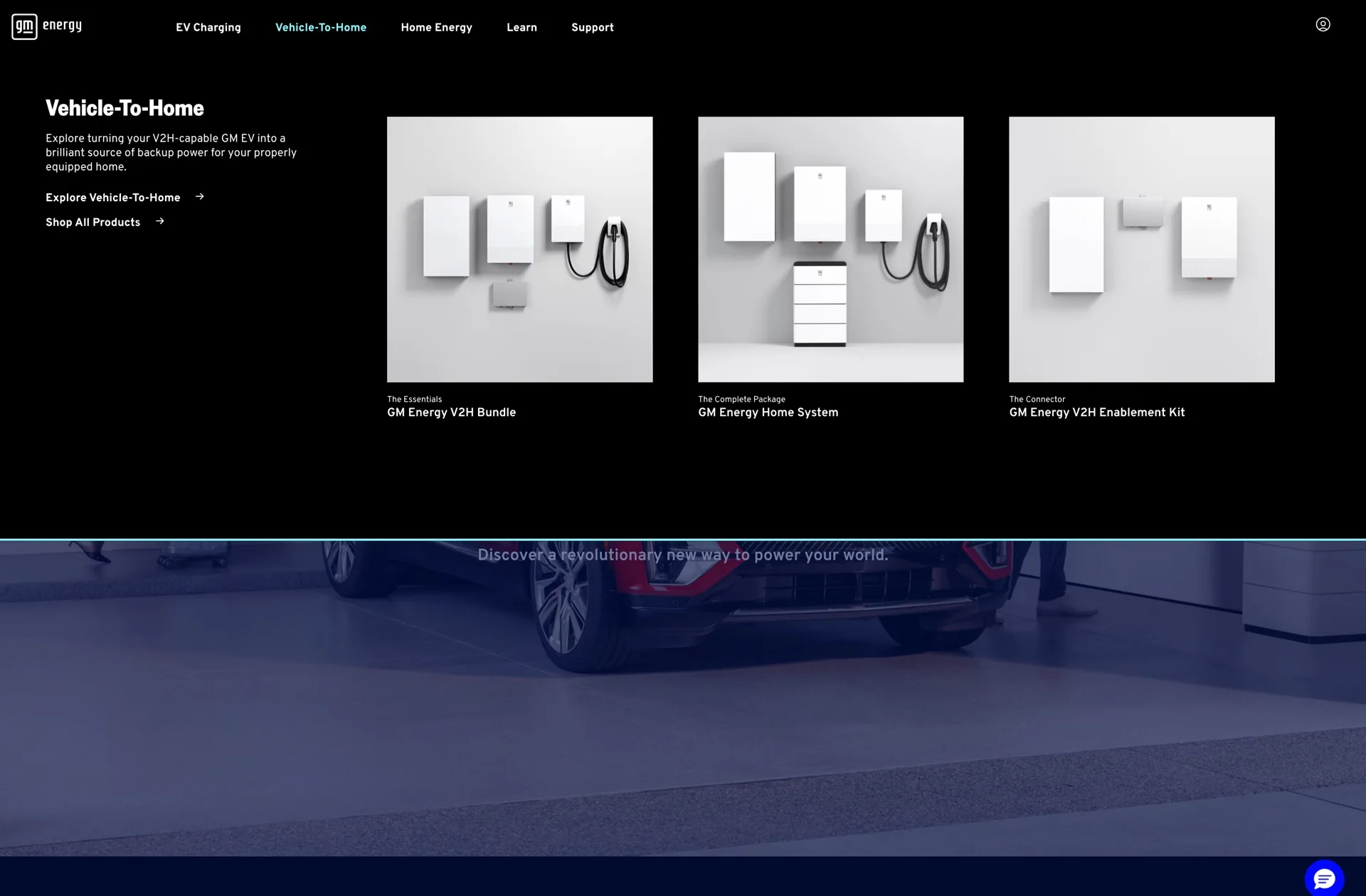
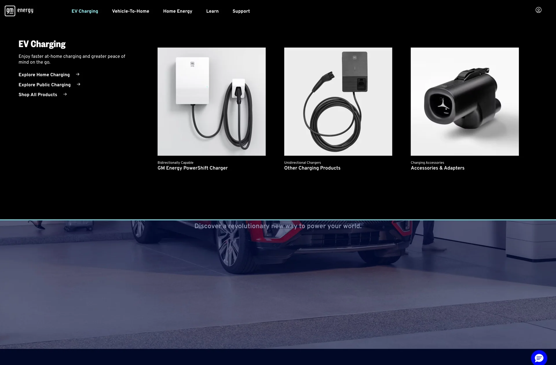
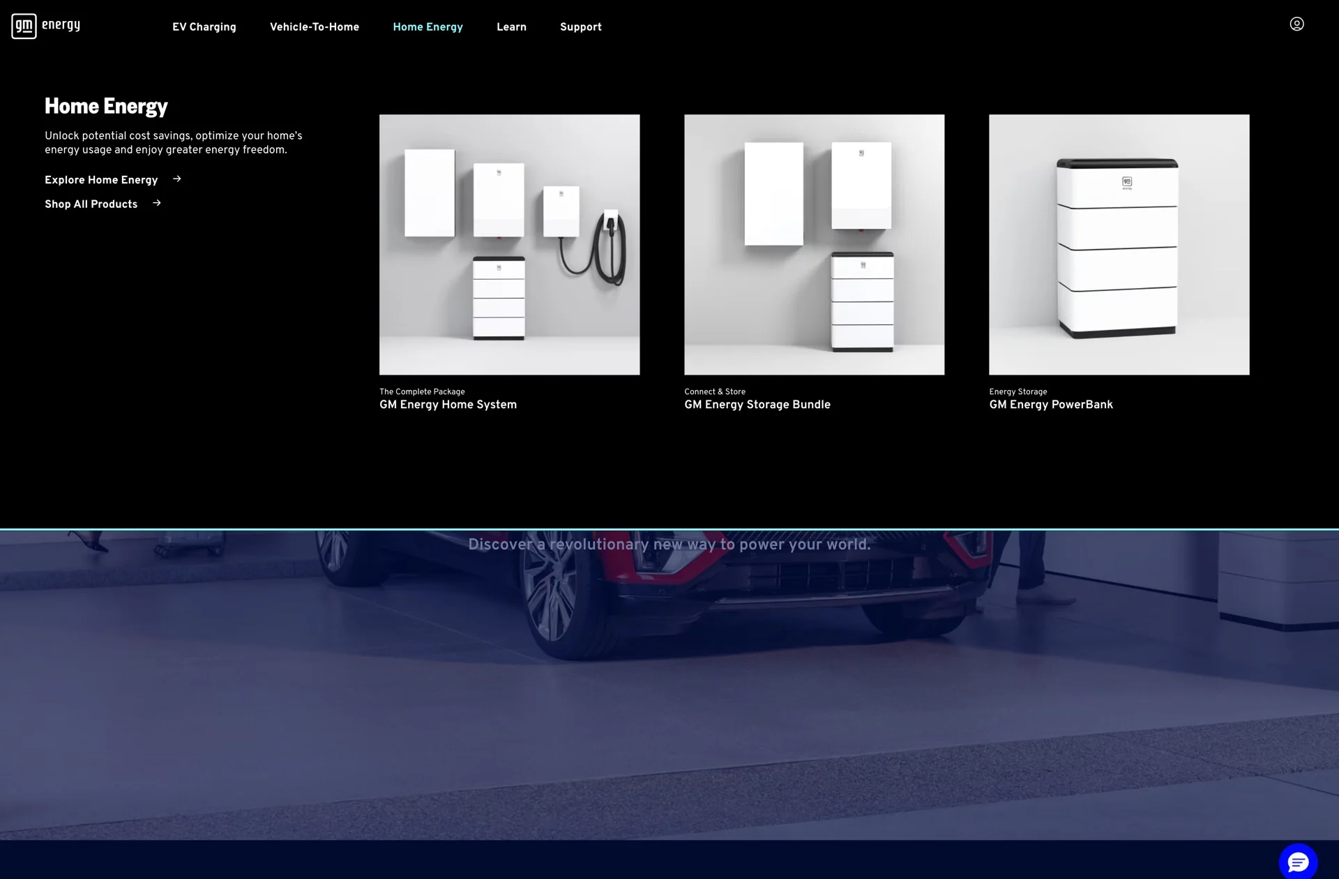
To streamline navigation across a complex product ecosystem, we implemented mega menus featuring visual wayfinding. By organizing categories around explicit customer shopping intent, the system provides both new and returning users with frictionless pathways to purchase, educational content, and support resources.
Checkout experience
Buying a home energy system took weeks. The customer added the product to their cart, went through an installation quote, waited for it, came back to finalize the cart, left for a separate site to apply for GM Financing, returned to pay, and that payment was only a deposit, because the install wasn't done. Scheduling the install meant another partner site, then a physical visit to measure the home and pull permits. Only after all of that did anyone know the all-in cost.
That was the barrier: a willing customer had to work through weeks of steps before a sale could happen. I worked through the install quoting process, checkout and financing together, consolidating those steps inside the GM Energy site so the sale could finish with less friction and less chance of abandonment.
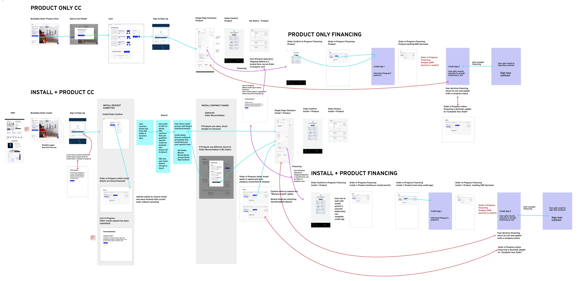
The checkout experience allows the customer to choose a product, view available installation quoting options, and estimate their pre-approval for financing. These all happen in one flow, keeping the customer engaged and ready to make a decision to move forward with the financing credit application and installation appointment.
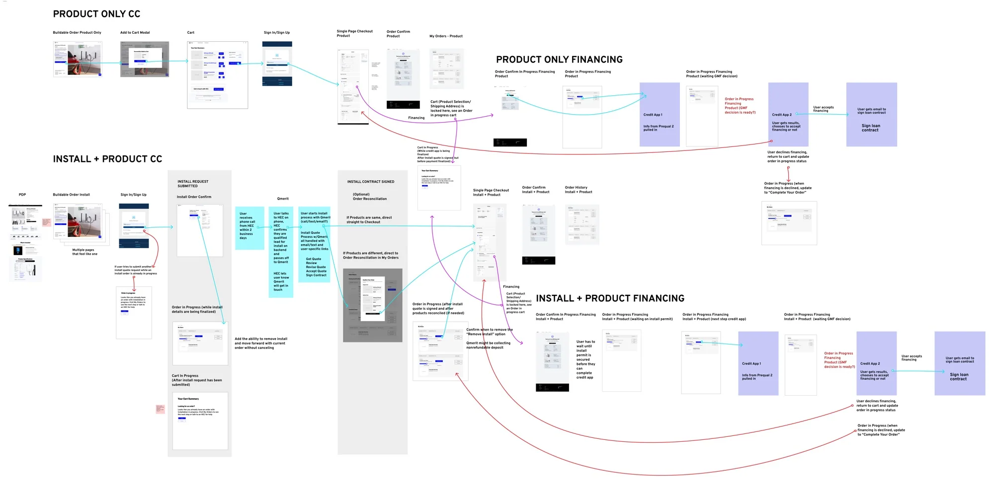
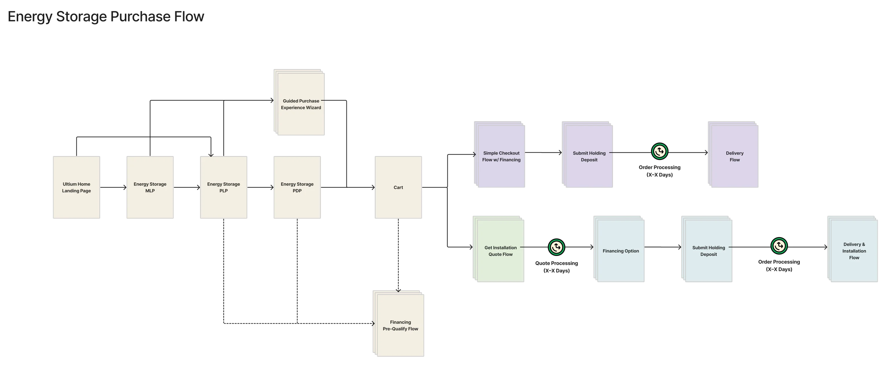
The branches on the right of the board are the combinations an order can take: hardware on its own, hardware with installation, with or without solar, paid by card or financed through GM Financial. They are variations of the same checkout, not trips to another site.
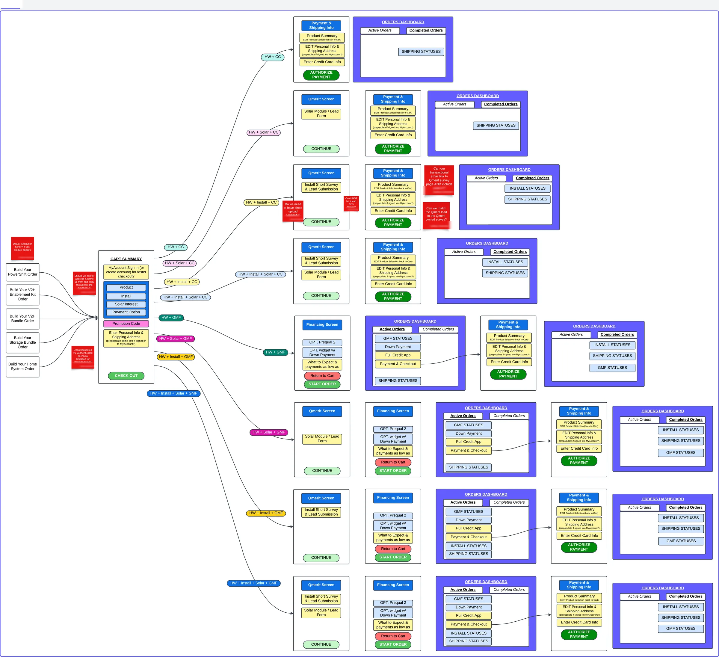
Checkout wasn't one flow; it was a matrix of business flows spanning hardware, installation, financing, and payment states, each mapped end to end with order management and partner systems.
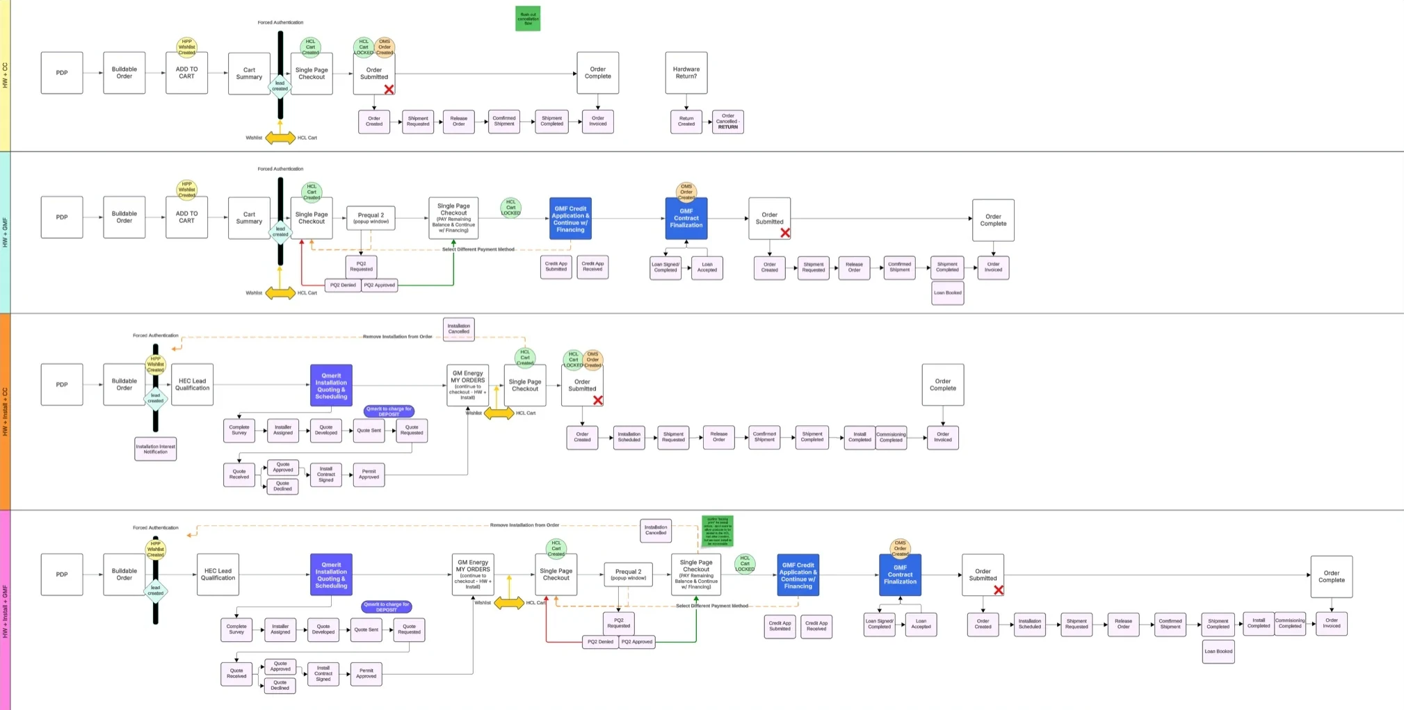
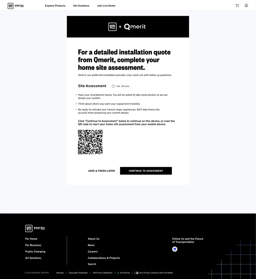
Installation is where the purchase leaves the screen. Inside checkout, a home assessment turns the install into a priced quote: eligibility first, then the cost folded into the order total, so the customer never leaves the flow to find out what it really costs.
Storyboarding is a technique I proposed so we could show the client visually what everyone involved is doing at each moment, both on screen and off. This experience is more than a customer and a screen. There is measuring, commuting, and work happening around the purchase, and all of it needs to be considered when we ask someone to sit down and go through a purchase and an installation quote. The boards give the team a picture of what goes on off screen to complete the purchase, and they surface the flow and the challenges that the customer, the vendor, and the people around them face while getting it done. That understanding is what built empathy across the team, and it showed up directly in the design decisions that followed. The install consultation is the clearest example: an authorized installer standing in someone's garage, where the digital experience has to hand over to a person.
The journeys said where each moment happened; the storyboards showed what it looked like. I developed Disney-style storyboards across five workstreams: the shopping experience, checkout, Energy Genie, the installation experience, and the executive dashboard, using images and captions to walk clients and the team through the journey, and coaching teammates on what each frame needed to carry: the physical and emotional decisions a customer faces at that point. The sequence below walks through the in-person install consultation, with the customer's view and the consultant's view side by side in every scene.

Financing used to mean leaving the site. Customers went to a separate GM Financial site to apply, then came back to finish the order. I wanted to keep the customer in the flow on our site, so I designed a prequalification form that asks for only the bare minimum needed to return a preapproved amount.
The amount only helps if the customer can trust it. In working sessions between our team, GM Energy and GM Financial in Detroit and Austin, we got a guarantee: if the prequalification comes back approved, the credit application will be approved too. That promise is what let us put an instant prequalification inside checkout. The customer sees the amount and decides whether to go forward with it, then moves on to the installation quote and down payment knowing the financing will be there to complete the order. Our director ran those sessions, and both companies worked through my checkout and financing designs in them.
Behind the visible flow sat a lot of combinations. Checkout wasn't one path but a matrix: hardware only, hardware plus installation, with or without a down payment, in states where financing was available and states where it wasn't, at full approval, partial approval, or decline, plus agent-assisted orders placed on the customer's behalf. Each permutation needed its own designed states and its own validation, and we ran user-acceptance testing across roughly thirty scenarios to prove the flow held together.
GM Financial needed a full social security number to return real rates. In testing, people said an SSN field with no explanation made the company look like a scam, and being asked to prequalify twice without knowing why made them lose confidence. Removing the field would have meant no real rates, and asking for it later would have meant asking twice. So I kept the field and added a short explanation at each sensitive step: why we ask for it, what happens next, what the customer gets back, and how it affects their credit. It made the flow longer, but post-launch testing found the process well designed.
"Overall, the feedback highlights a well-designed process with room for minor improvements in clarity, education and support."Post-launch usability readout, financing flow, N=16
Building a testing practice
After launch, research became a standing operation. I structured it as two tracks, so the team could both validate designs in progress and evaluate what had already shipped:
I set the framework the practice runs on: what we're asking, why we're asking it, what answer we're looking for, what it means, and what we do with it. Allison Baker, the senior designer I worked most closely with, started the testing method with me, then took ownership of it and refined it into the practice shown here.



| Formal | Informal | |
|---|---|---|
| Intent | Retroactively evaluate shipped experiences | Proactively validate solutions mid-exploration |
| Scope | Comprehensive · fully built or hi-fi prototypes | Narrow · lower fidelity, one question at a time |
| Velocity | ~1 per month | 3–4 per month |
| Planning | A month ahead · ~4-week lifecycle | Coincides with the design release schedule |
Dozens of studies ran across both tracks, recruited through UserTesting.com, moderated and unmoderated, desktop and mobile, with quarterly check-ins to the client. What they changed is shown where it happened: the product-page content finding, the promo-code sign-in, and the order-status fix are each told where the work is shown.
We also acted as a critical partner to GM's own analytics team, reviewing their survey and heat-mapping studies and returning assessments and recommendations. One finding shaped the PDP directly: product specifications drew the most engagement of any content, yet fewer than half of users ever scrolled far enough to see them.
Designing the ownership phase
In late 2023 the engagement expanded to cover what happens after the sale, with an explicit brief: give the ownership phase the same design attention as the purchase phase.
That meant journey mapping and service blueprinting for everything after checkout, from installation handoff, warranty and support to returns and escalation, across a partner ecosystem where GM owned the brand but not every touchpoint: installers, solar partners, logistics providers, and an EV Concierge contact center whose agents needed training plans built around the new journeys.
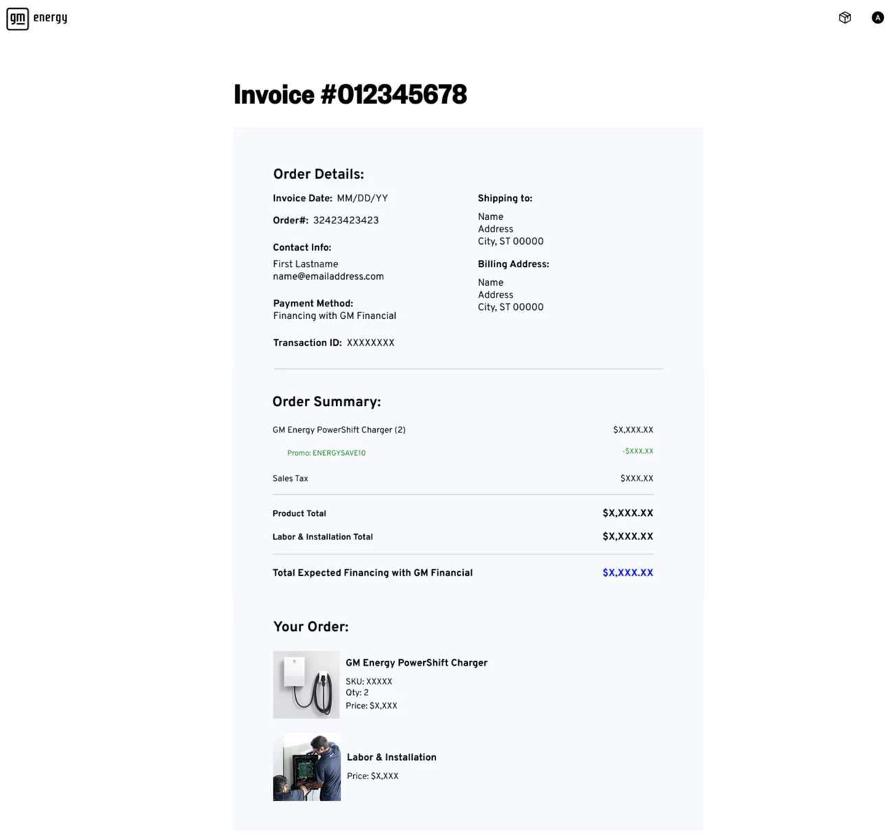
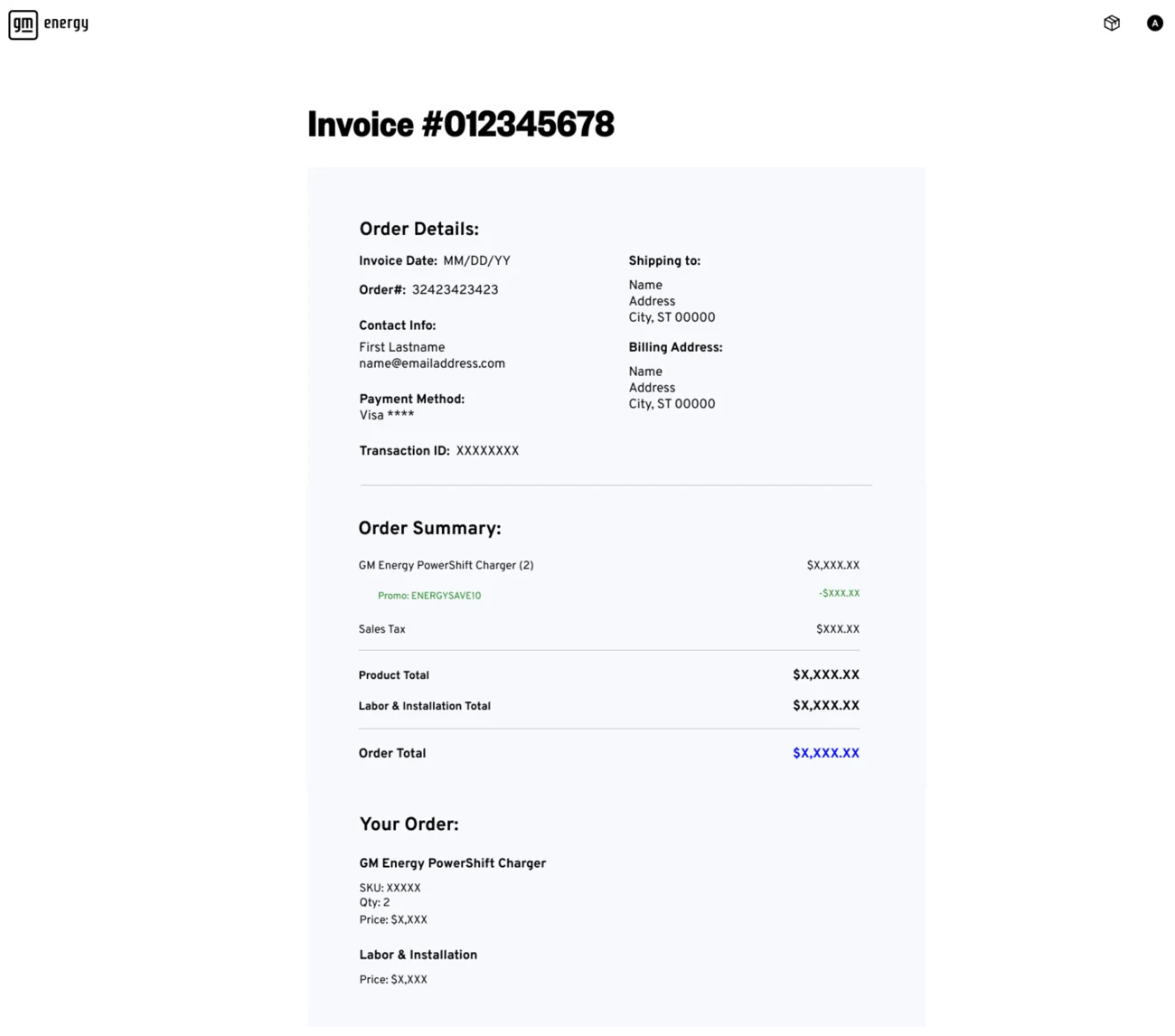
A HEMS order is hardware plus licensed electrical work, and often a loan on top, so even the receipt had to represent all three at once. "Labor & Installation Total" sits as a peer to "Product Total" rather than as a line item under it, and the financing variant replaces "Order Total" with "Total Expected Financing with GM Financial", a different promise to the customer, and a different document.
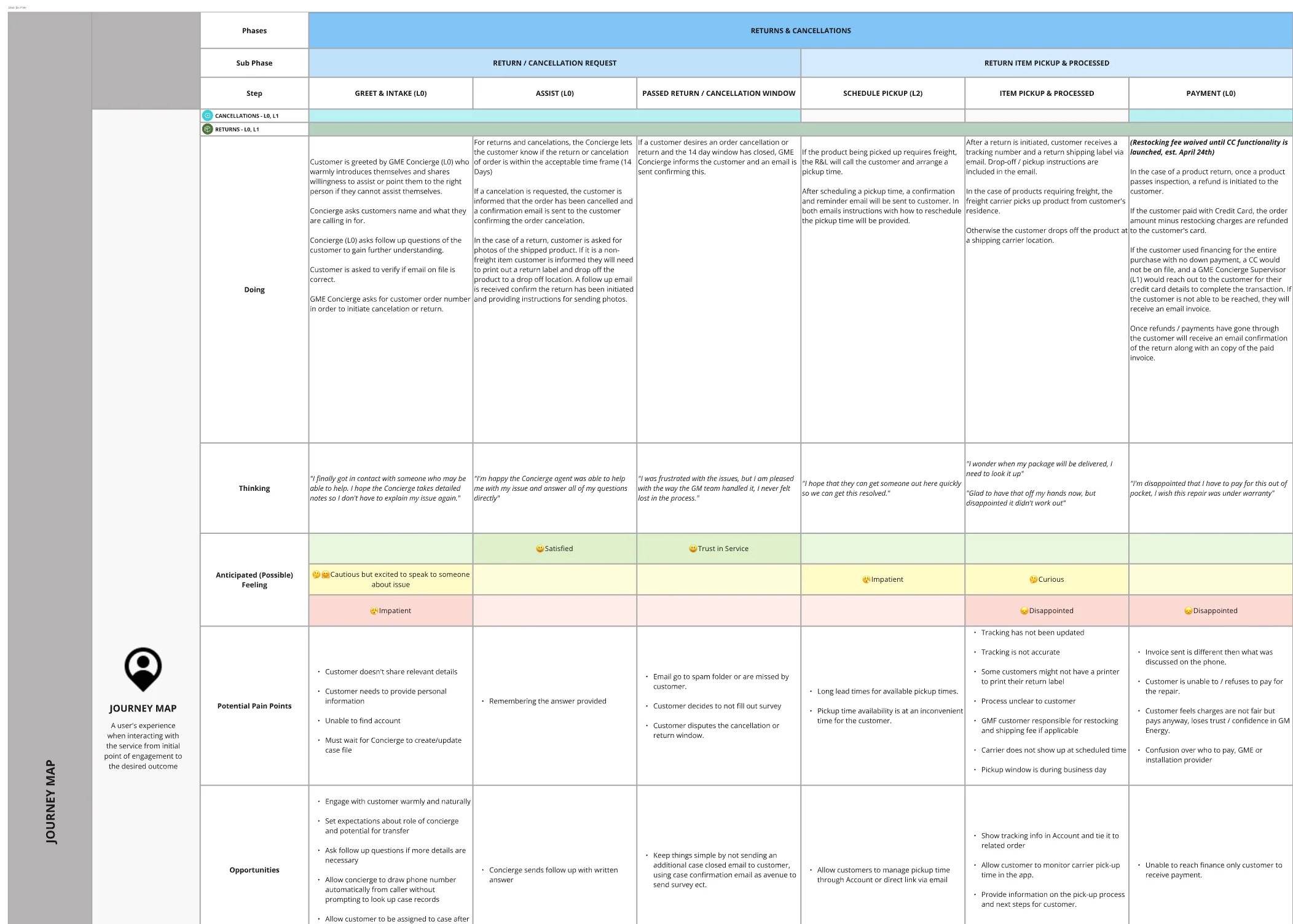
We mapped the unhappy paths the same way. The returns and cancellations journey runs six steps across two sub-phases, tracking what the customer is doing and thinking at each one, the feeling we anticipated, the pain points, and the opportunity that came out of it, with the concierge escalation tiers mapped alongside, since who picks up the phone changes what the experience can be.
It also meant designing the feedback system itself. We mapped customer-satisfaction survey triggers across the entire ecosystem: post-sale, post-install, post-support-call, per partner, and then did the less obvious work of pruning them, prioritizing which moments genuinely warranted asking so customers weren't buried under surveys from four companies about the same purchase.
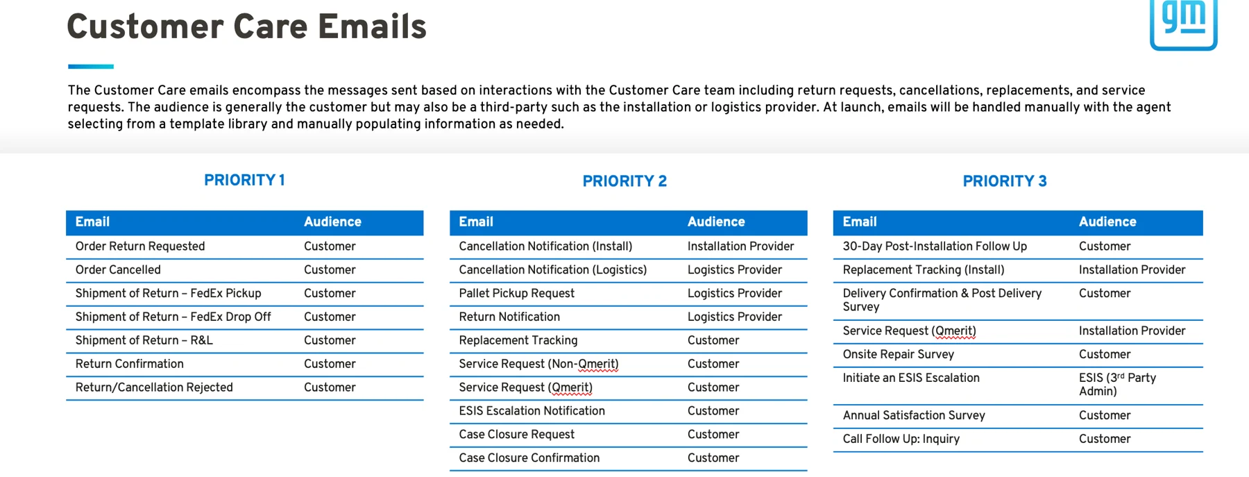
The same logic applied to the messages themselves. Every email the care team could send was inventoried, assigned an audience, and ranked into three priority tiers, because at launch an agent would be picking these from a template library by hand, and the first tier had to be the one that actually mattered.
Three more tracks ran alongside the storefront and checkout: the Energy Genie, an executive dashboard, and a sales guide. Each came out of the same blueprint, or out of a problem the team ran into on the way.
Energy Genie: helping people work out what to buy
A home energy system is a considered purchase. Testers told us they spend weeks or months researching one. They wanted to explore on their own, and they were open to using a tool as long as it was accurate, unbiased and actually personalized.
What existed was a menu-driven assistant that could answer prompts and pass you to a human, but couldn't help you decide what to buy. We looked at how other companies handled it, Ford's EV lifestyle quiz, Bosch's smart-home configurator, Logitech's setup finder, and at what home-battery owners were saying in their own communities.
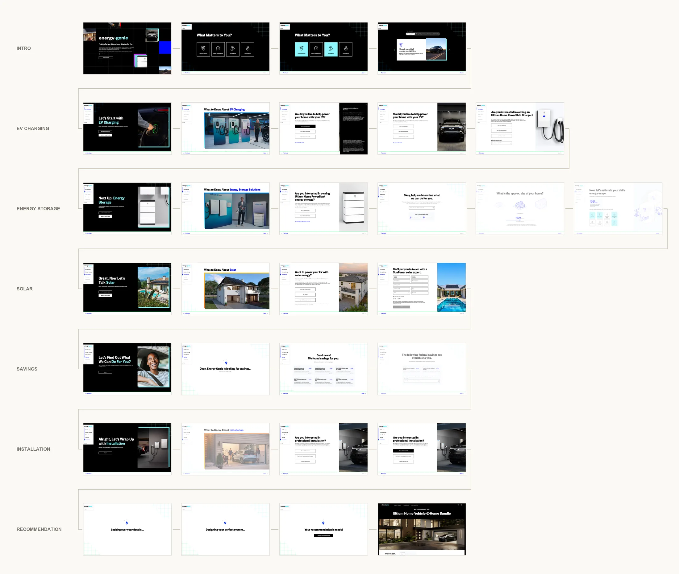
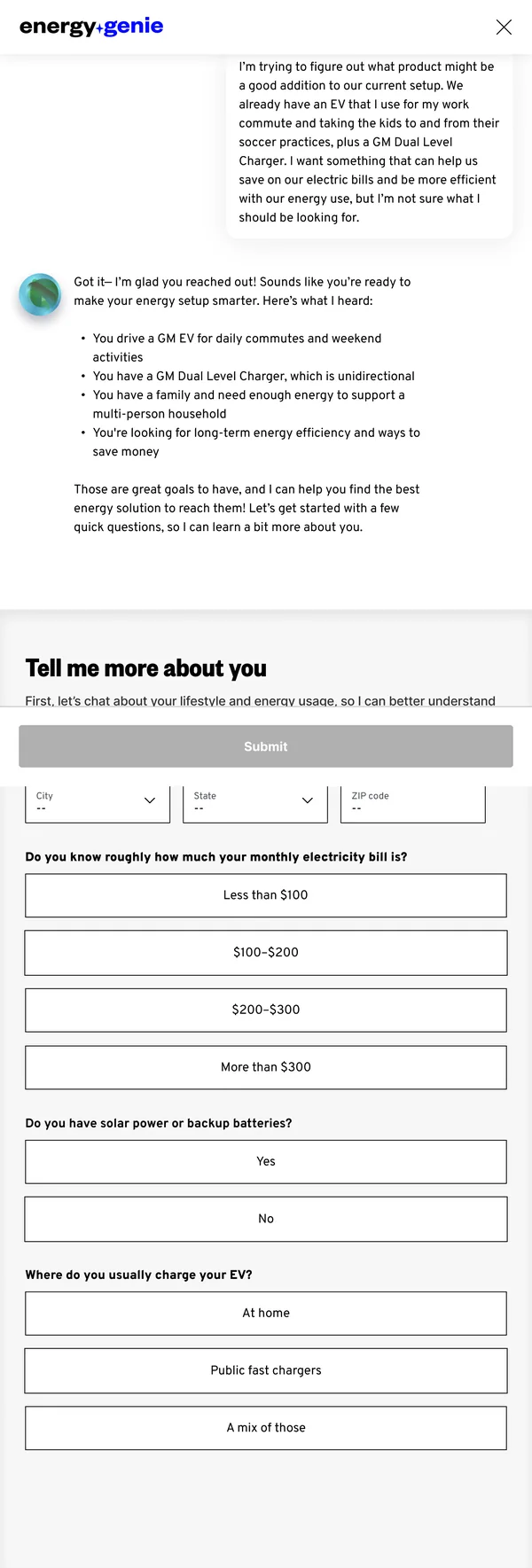
The first version was a questionnaire. It ran in five sections: EV charging, energy storage, solar, savings and installation, with Previous and Next at the bottom of every step. It calculated as you went: pick your square footage and the appliances you'd want running during an outage, and it estimated your daily and outage energy use, then matched that total to a product bundle. The page explained it as three steps.
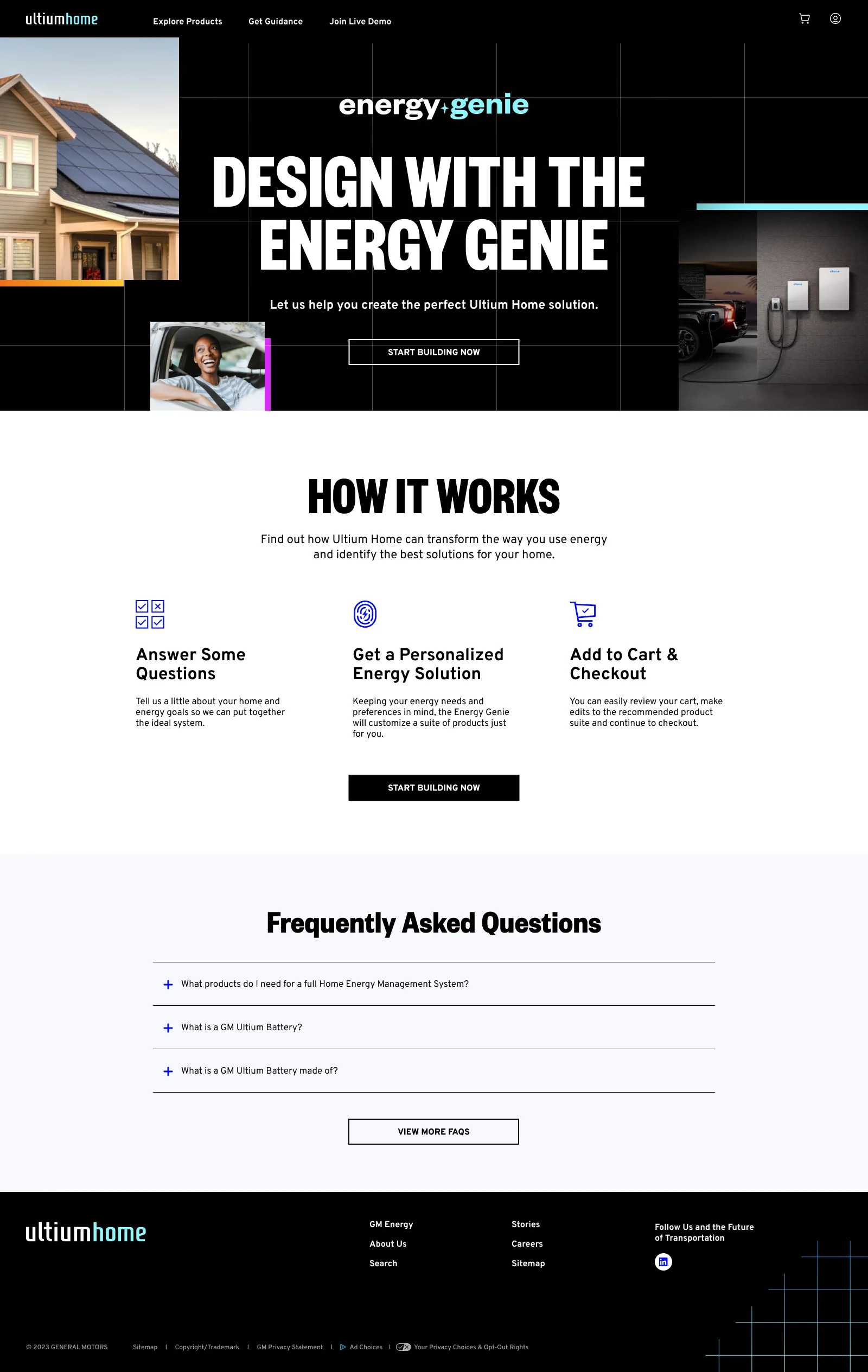
- 01Answer some questions
- 02Get a personalized energy solution
- 03Add to cart & checkout
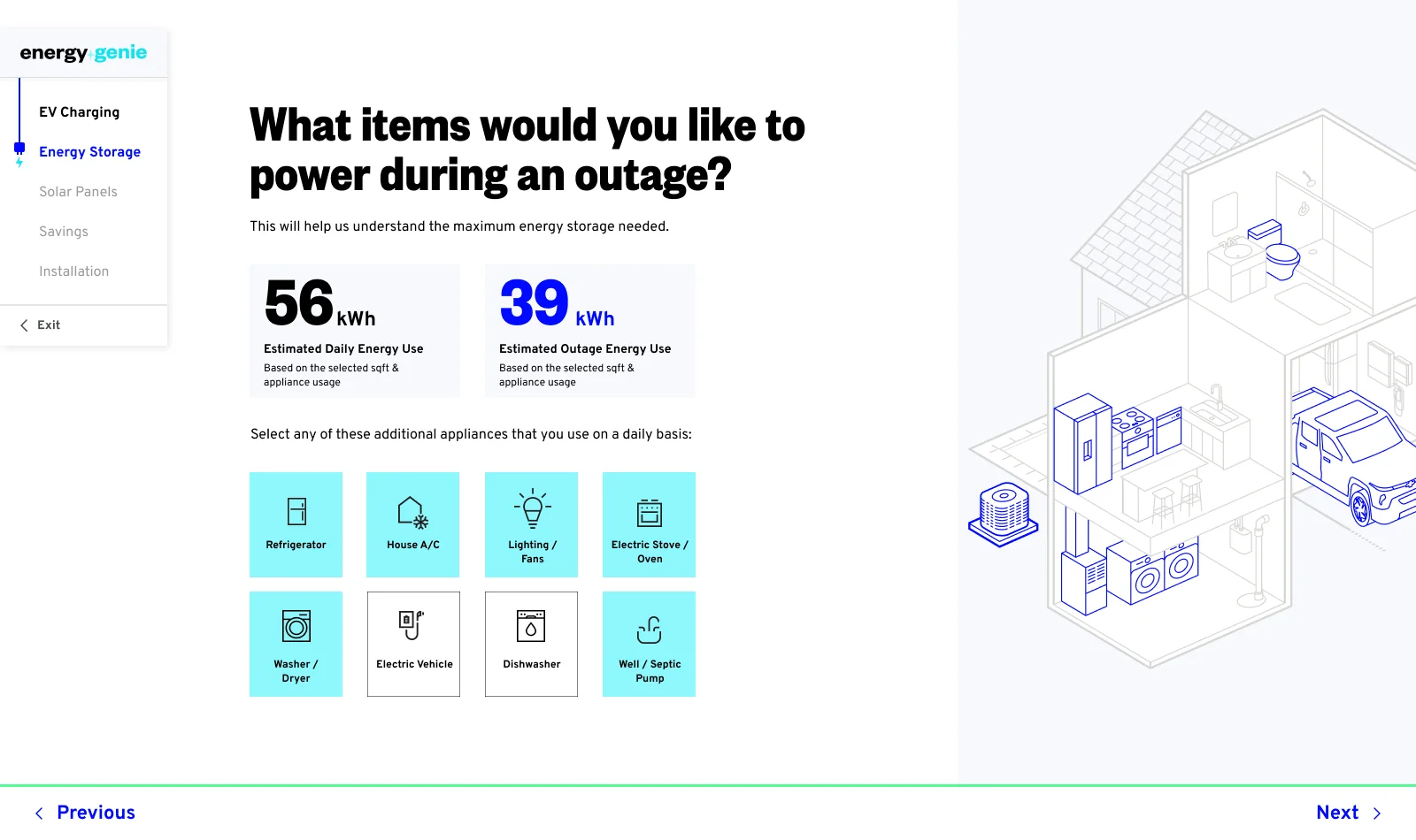
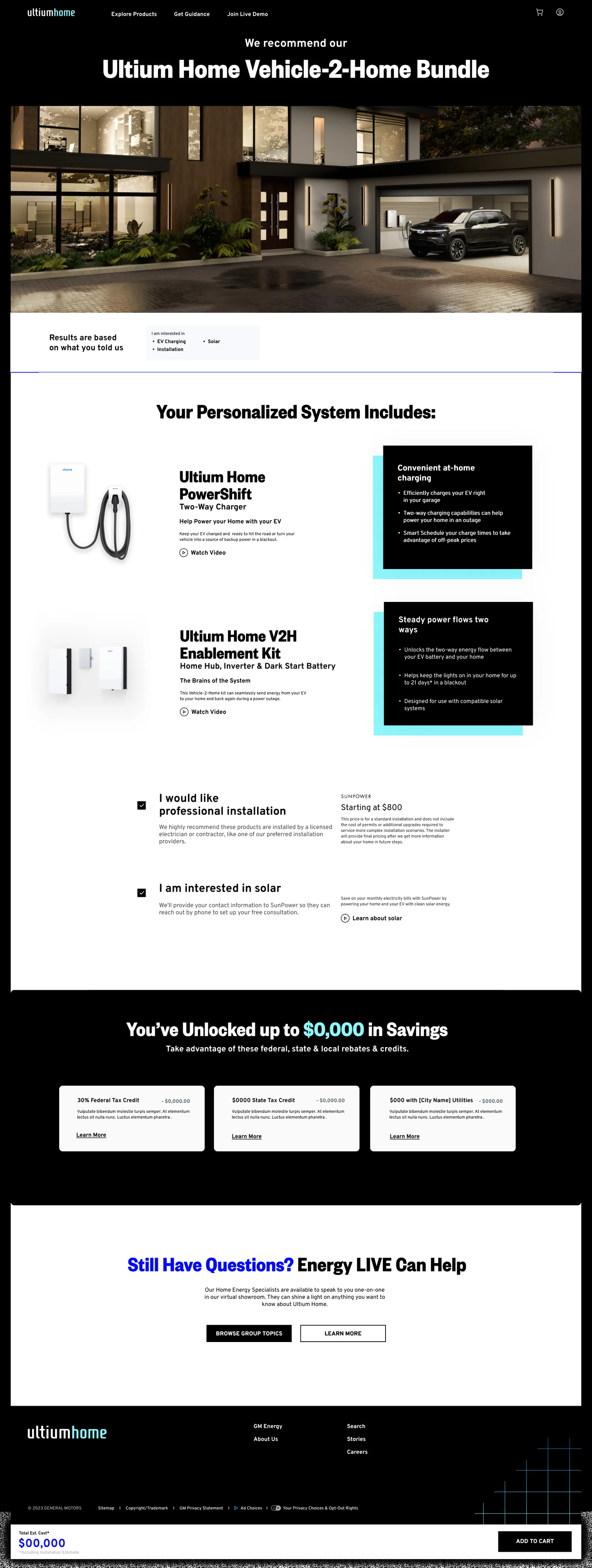
We kept testing it after launch. Half the testers found the vehicle-confirmation step redundant with the one before it, so we cut it. Half found the "Goals" page unclear next to "Priorities," so we merged the two. The recommendation page itself tested well: 80% rated it 4 or 5 out of 5, and called the personalized reasoning and the outage-risk section thoughtful. But the same testers, including the ones who rated it highly, wanted two or three options instead of a single answer, and 60% wanted installation detail before they'd commit. Those two gaps are what we took into the next version.
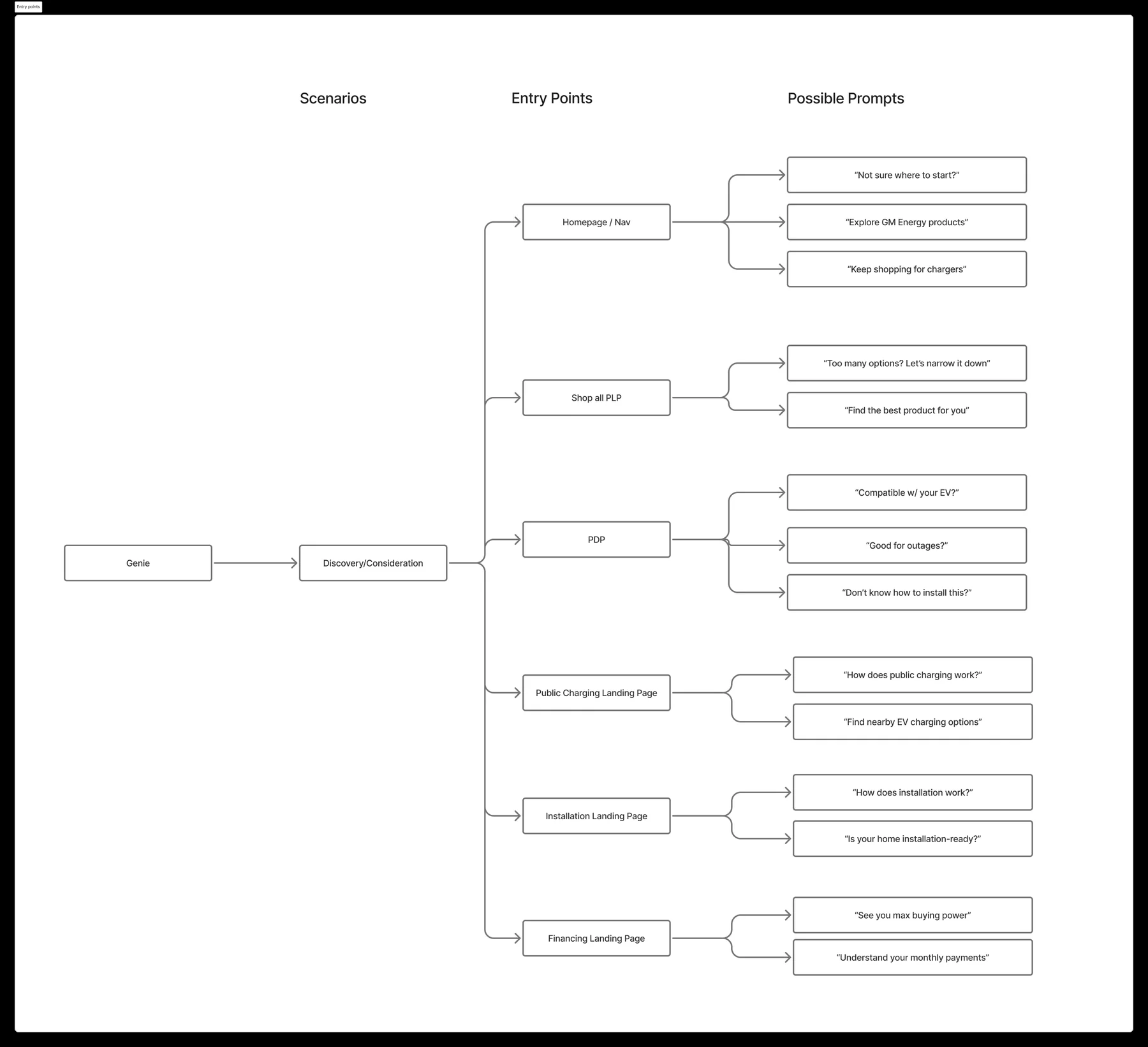
For the second version we moved Genie out of its own page and into a panel that could open anywhere on the site. We mapped six entry points: the homepage and nav, the shop-all listing, product pages, public charging, installation and financing, and wrote a different set of opening prompts for each. On a product page it asked "Good for outages?" or "Don't know how to install this?" On the listing page, "Too many options? Let's narrow it down." On financing, "Understand your monthly payments."
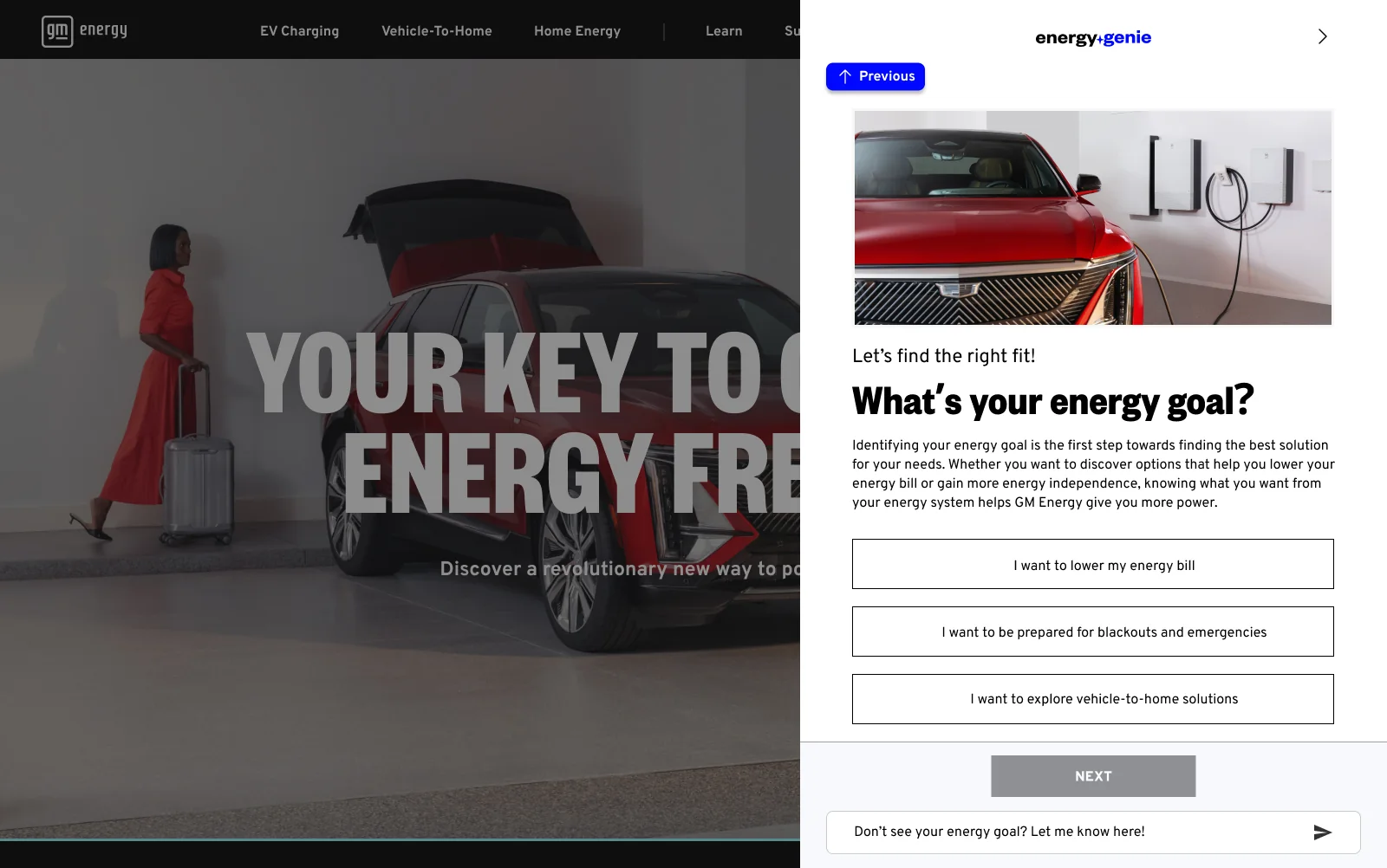
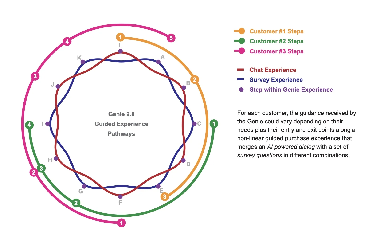
From there we designed two routes through it. Both start by collecting what the customer needs, but they differ in when the recommendation appears.
The guided path is for someone who doesn't know where to start. The entry prompt says exactly that: "Don't know where to start? Let us guide you!" It asks structured questions about where you live, your monthly bill and your energy goal. Under every set of options we left a free-text field open, so a question that didn't fit the choices wouldn't trap anyone. It ends on one recommendation with the reasoning attached.
- 01Collect customer needs
- 02Answer outstanding questions
- 03Recommend product
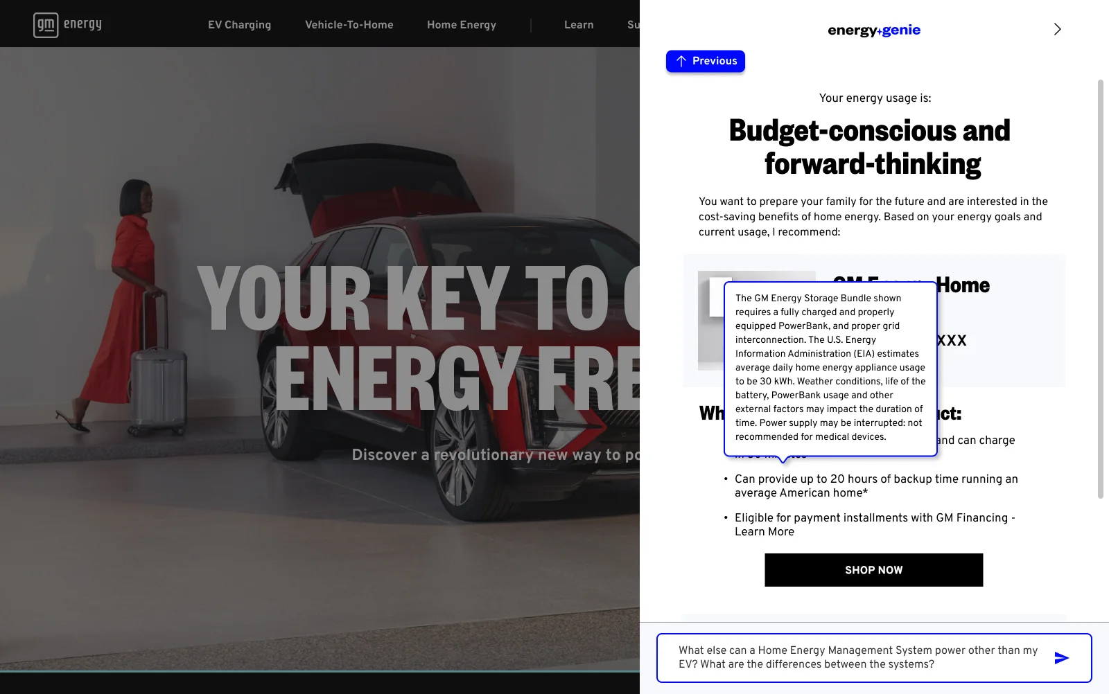
The chat path starts from whatever the customer types. Genie reads it back as a summary first, so they can correct it before anything else happens. It pulls in property data, local utility information and outage history, which lets the answers be about that specific house. In the prototype a customer says their biggest worry is a storm-related outage, and Genie replies that their area had repeated outages last spring. This route reaches a recommendation earlier than the guided one, then keeps adjusting it: two products side by side instead of one, a plain explanation when the customer asks what V2H means, and an energy profile chart that redraws as they answer more.
- 01Collect customer needs
- 02Fine-tune recommendations
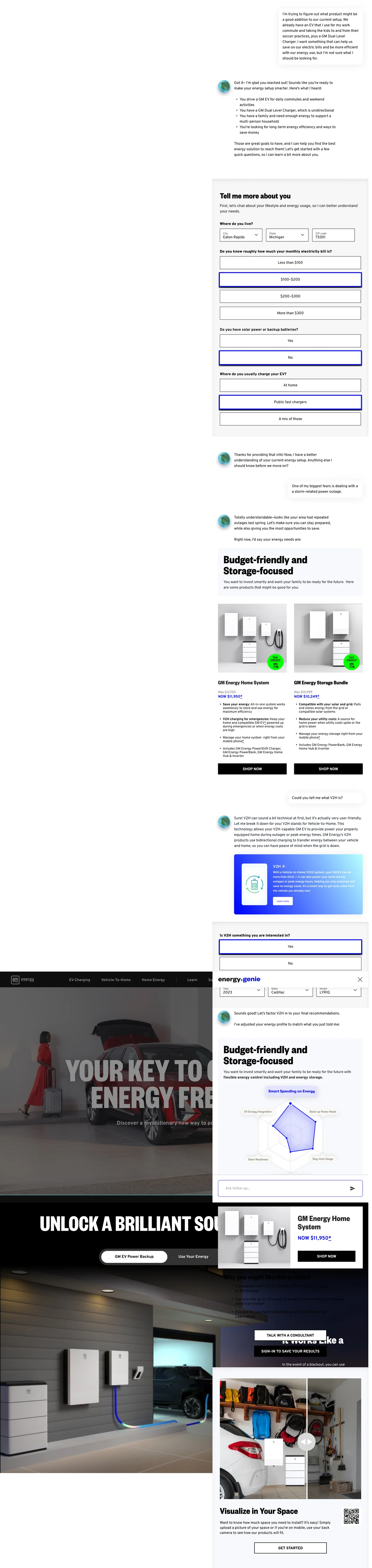
Showing two products, and leaving the reasoning open to questions, was our answer to what the testing had told us. The two routes aren't separate products either: the conversation can hand off to the guided questions, the guided path keeps a chat field open the whole way through, and either one can pass the customer to a human Home Energy Consultant.
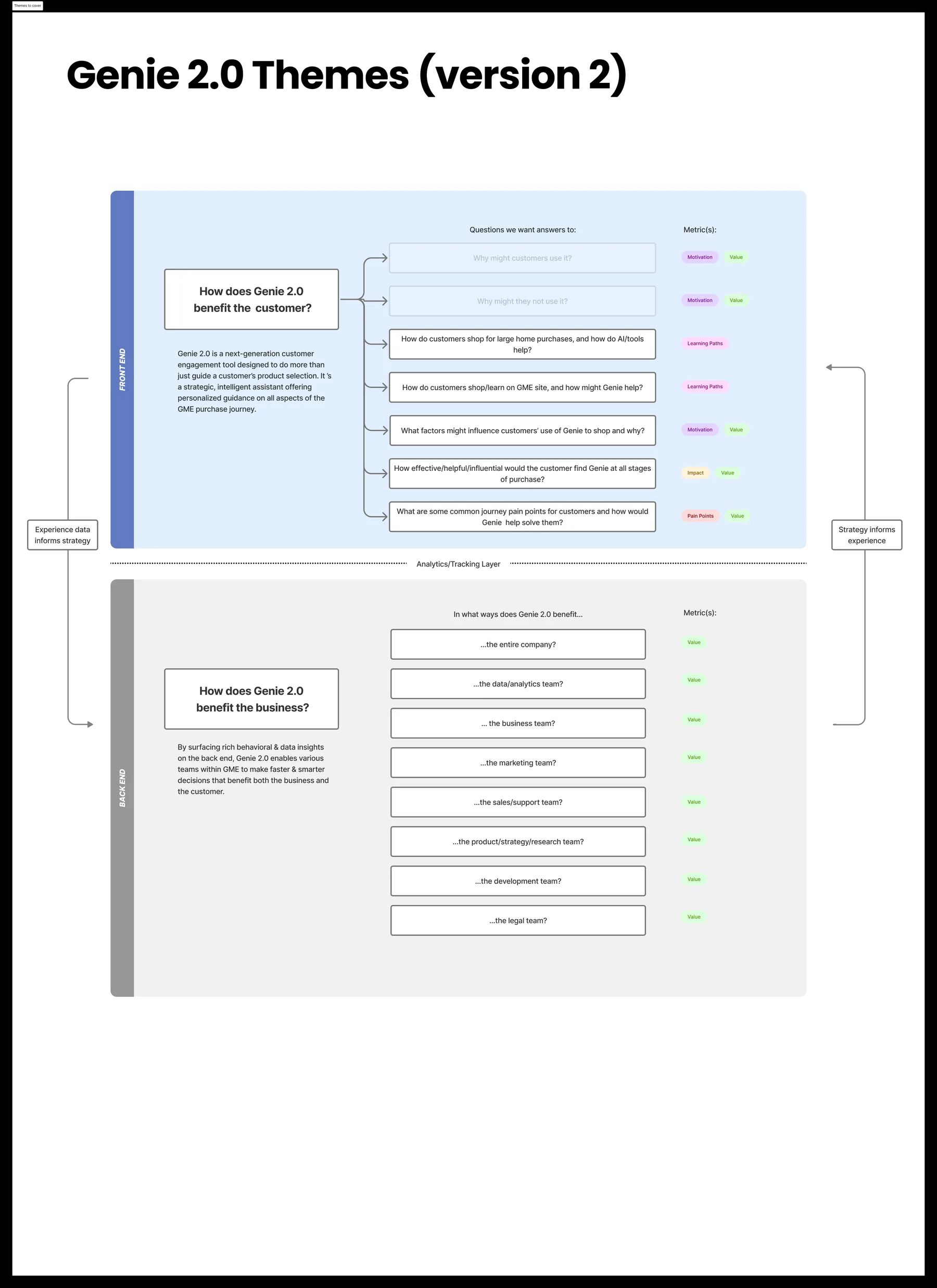
We framed the research around two questions instead of one: how does Genie 2.0 help the customer, and how does it help the business. The board below splits them, with the analytics layer in between and arrows running both ways: experience data informs strategy, strategy informs experience. Our senior designers led the business framing and synthesis. I set the direction it had to serve, led the Genie 1.0 work it built on, and created the storyboards each persona's journey runs on in these concepts.
The case that came out of it went past buying. The argument was that every conversation is a small piece of research: which products draw real interest, where people hesitate, which terms they find unclear or intimidating. The value proposition put it as an assistant layer that "captures real customer questions in their own words, offering ongoing voice-of-customer feedback without surveys."
Everything else follows from that. Interest grouped by location shows where demand is building: storage in zip codes that lose power often. Drop-off points become a diagnostic: which step loses people, and whether it's pricing, installation or comparing products. The inputs Genie already collects (home type, energy priorities, location) feed lead scoring instead of disappearing with the session. And because it's a conversation rather than a fixed page, it can test ideas: gauge whether customers want smart panels or V2G before any of it goes to market.
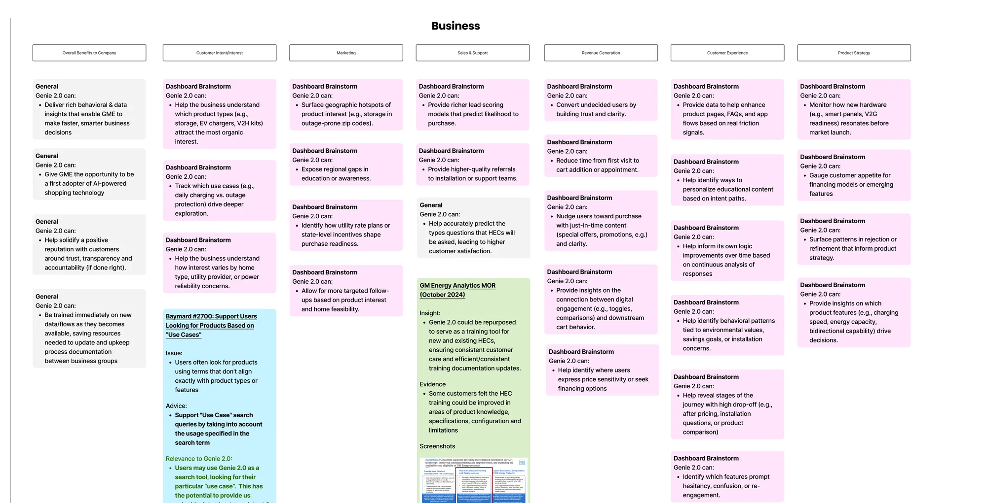
None of it shipped. Genie 2.0 was scoped and prototyped and then put on hold; it sits on the program status board between two other paused workstreams, with its usability test still dated TBD. The Genie that's live is still the survey.
Executive dashboard
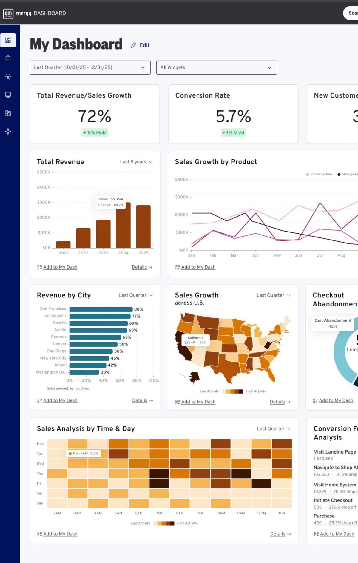
The existing Adobe Analytics setup was messy and had no clear direction. Reports took real effort to decipher before anyone could say what the numbers meant, let alone act on them. I started by gathering everything their current analytics could tell us, then brainstormed with the team on what a dashboard should include and which data points would actually help the executive team make decisions. The dashboard became one of the largest efforts alongside the storefront.
It consolidates customer interaction data from three places that were never connected: the GM Energy website, the My[Owner] app, and the proposed Energy Genie assistant. Each system reported on its own (page views from the site, sessions from the app), with no way to follow a single customer across them. Combined, the data shows the full path a customer takes, including where they hesitate and where they stop.
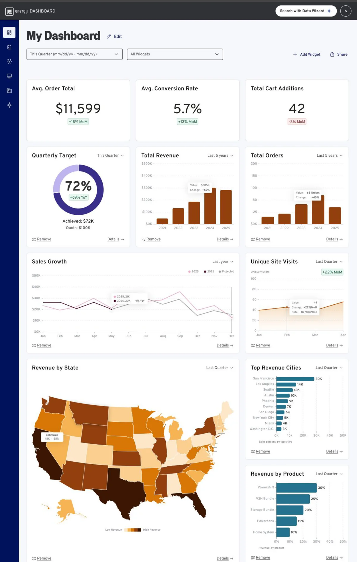
An AI assistant sits inside the dashboard. It summarizes performance, flags anomalies, explains what changed and why, and answers questions typed in plain language: cross-reference residential growth against storage adoption, or show me what the top-performing regions are doing differently. It returns a written answer and a suggested next step. That was our answer to the deciphering problem: Genie does that work for you, so time goes to making decisions instead of working out what the data means.
The same system had to serve people who look at the business very differently. A VP scans weekly for trends and anomalies. A director works weekly too, but investigates what is driving them. A sales manager opens it daily and drills into their own regions. Each role gets a dashboard built from the widgets that answer their questions.
To get there, I ran a work session turning our brainstorm into plain statements: what each GM Energy employee can do with this information, and what outcome it leads to. Those statements set the direction for what the dashboard should include, and they gave me the script. I created a persona for each of three levels of the organization, wrote their scenarios, and storyboarded them as one continuous story. Each persona starts at the dashboard and makes a decision that becomes the next persona's action, so the final action traces back to real data from a connected system. I also designed the dashboard each persona sees, matched to the detail their role and decision-making responsibilities call for.
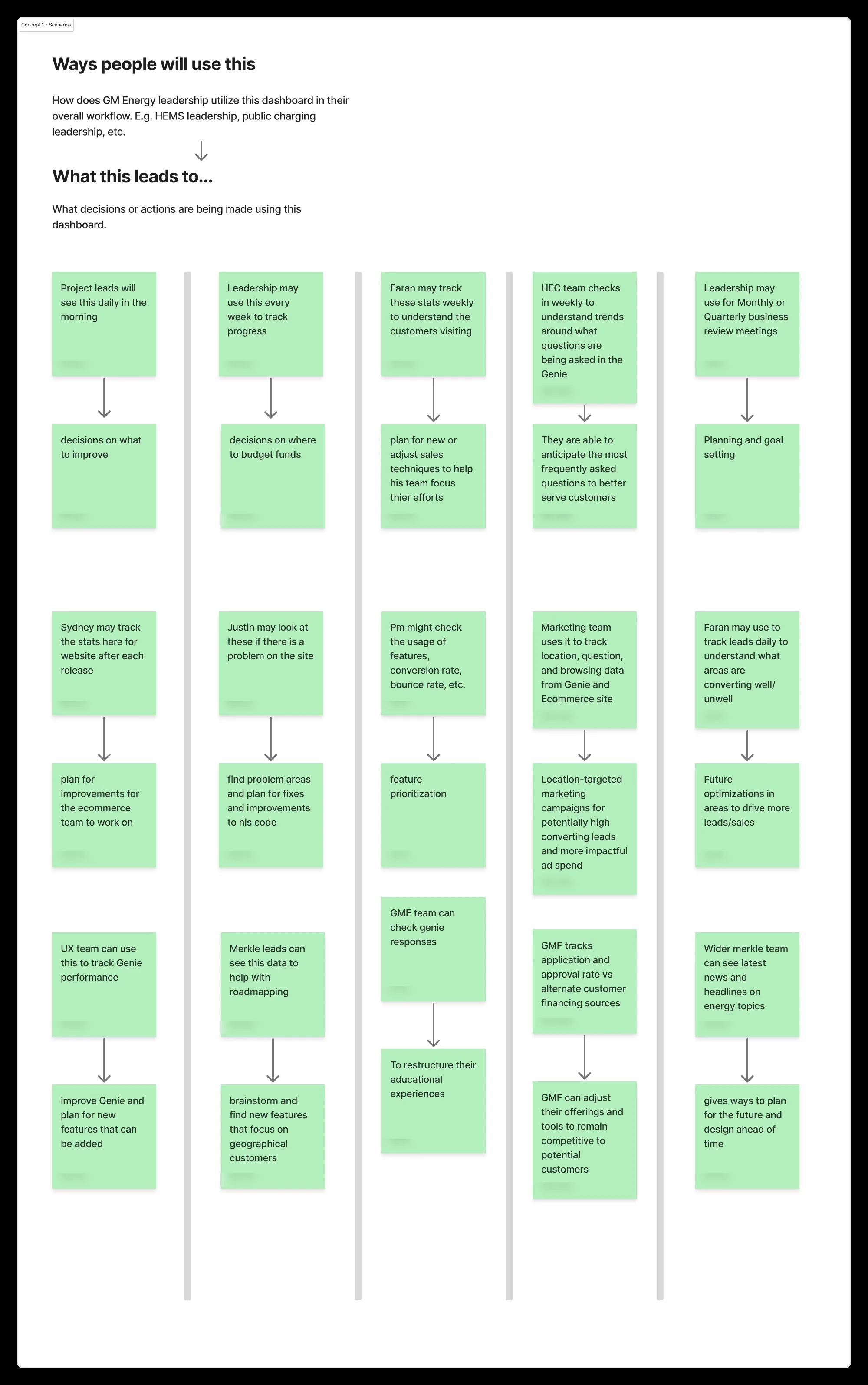
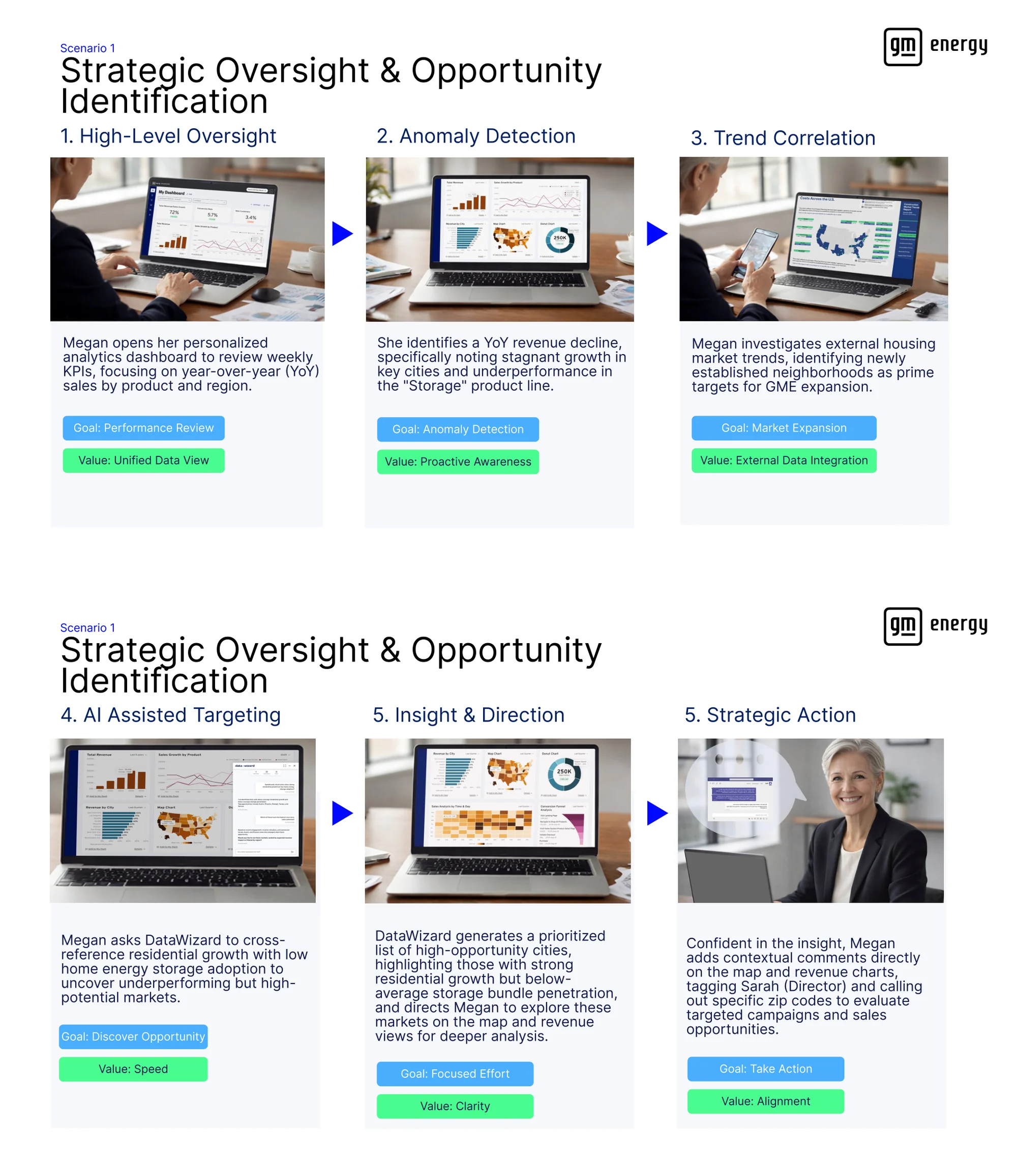
- The VP sees that something is offReviewing weekly KPIs she finds a year-over-year revenue decline: growth stalled in specific cities, the storage line underperforming. She asks the assistant to cross-reference residential growth against low storage adoption, gets a ranked list of high-potential markets, comments directly on the map, and tags her director.
- The director finds out whyShe sorts revenue by zip code to isolate the flagged areas, then follows the customer journey and finds people viewing storage bundles without adding them to the cart. Comparing those markets against the strongest ones, the assistant returns the difference: the top cities have active partnerships with energy providers. She briefs her sales manager.
- The sales manager turns it into a planHe asks why storage is declining in those regions and finds rolling blackouts are more frequent there: the same weather exposure that created the Rhonda persona, showing up as a sales opportunity. He pulls campaign success rates from the strong regions and builds a strategy to partner with electricity providers in blackout-affected areas, ready to take back to leadership.
Four capabilities support those steps: data from the website, app and assistant combined into one record per customer; an assistant that takes plain-language questions; annotations pinned to a chart and tagged to a colleague; and a separate dashboard per role.
- Engagement journeyEntry points, pathways and completion across website, assistant and app; abandoned versus completed flows; the trajectory from first curiosity to ownership.
- Product adoption and usageWhat is owned and how it is actually used: battery charge and discharge, solar generation against consumption, vehicle-to-home energy transferred, home and public charging behavior.
- Experience signals and frictionExit rates by product page, educational content that gets skipped, drop-off from the recommendation tools, alerts received against action taken, and the assistant's "did not understand" queries.
- Customer intentThe questions asked most often, what customers prioritize (resilience, savings, or environmental impact), which bundles they pick, and how many installations turn out to be feasible.
- Market and segment opportunityGeo-tagged interest by product, bundle adoption by region, segments with many views and few conversions, and risk profiles such as frequent outages driving storage adoption.
- Future-state readinessWhich features customers refine most often, a signal the value proposition is unclear; how often they disagree with a recommendation; and financial friction such as drop-off after the price is revealed.
The questions it answers are the ones operational reporting could not: which segments adopt full HEMS bundles, what keeps energy-curious customers from converting, how EV-first and solar-first customers behave differently, and where demand is concentrated. Beyond leadership, the same foundation answers a different question per team: what is driving financing abandonment, which hardware issues recur and where to intervene early, what customers ask the assistant about most, which features should shape the app roadmap.
One of our senior designers put the concept deck together and built the working prototype in Figma. It was pitched to the client and is currently on hold.
The sales guide
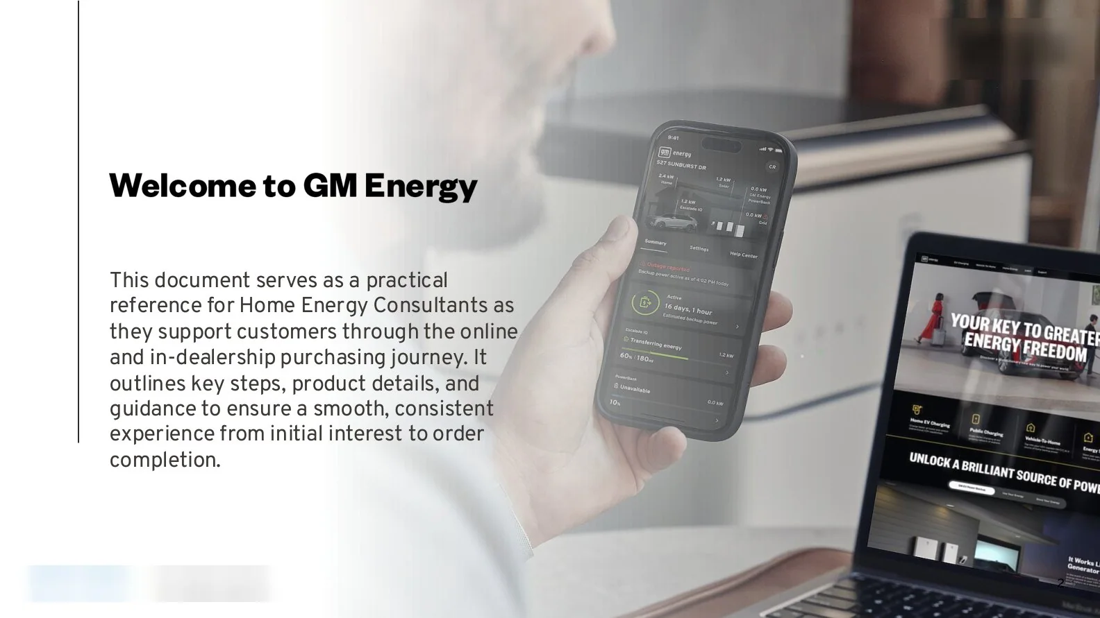
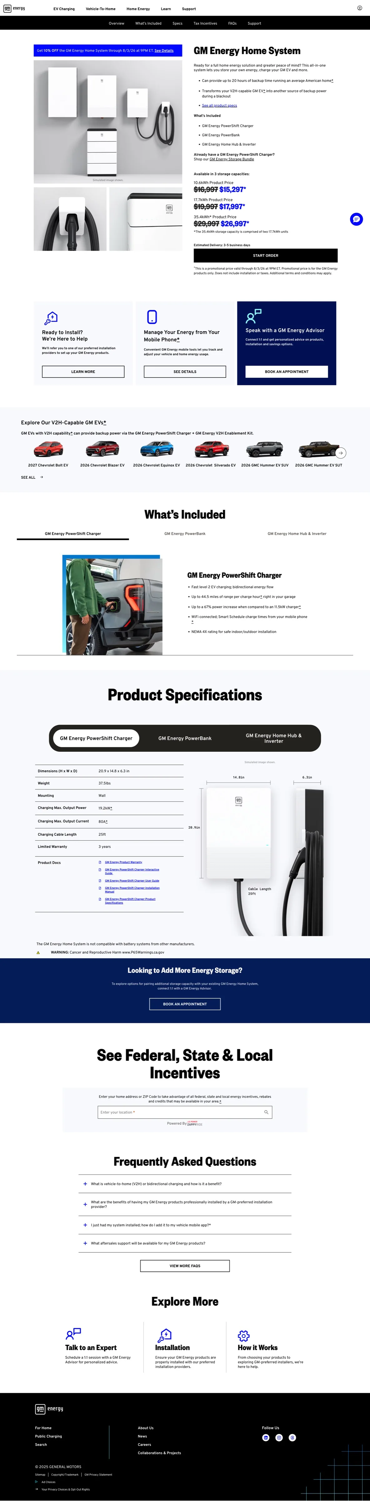
Home energy consultants needed a way to understand the site and guide their conversations with customers, so I built a walkthrough of the whole journey and stayed its primary point of contact. It was adopted across the GME sales organization. Seven versions came out between April 2024 and December 2025; consultant feedback reduced it from a 48-page graphics-heavy deck to a 35-page step-by-step guide.
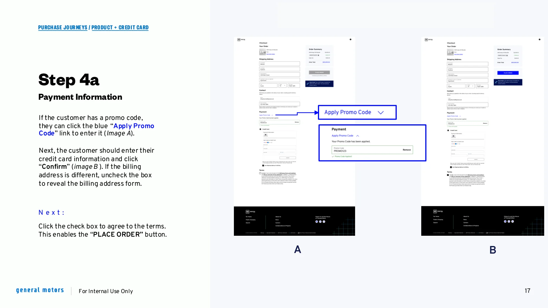
Walking a consultant through checkout, step by step
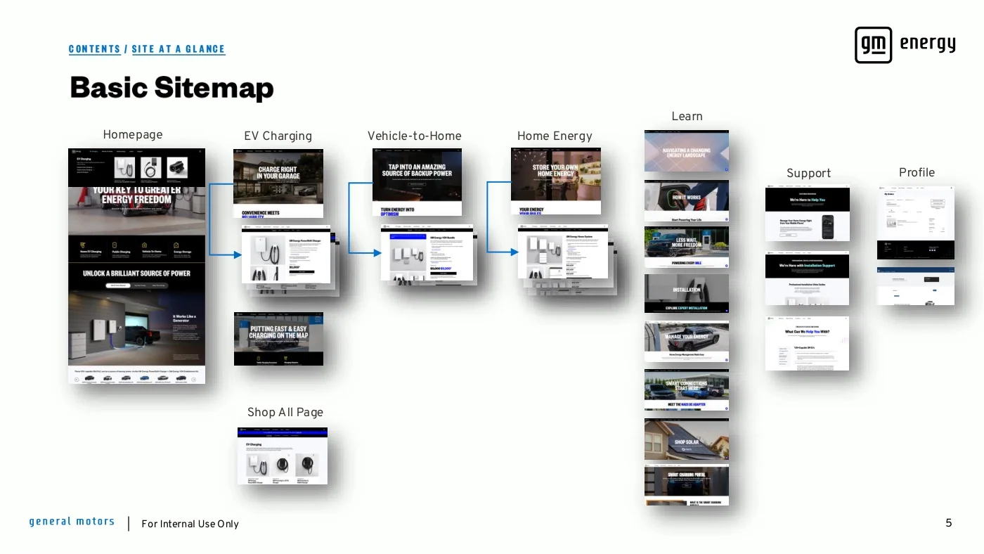
Site at a glance
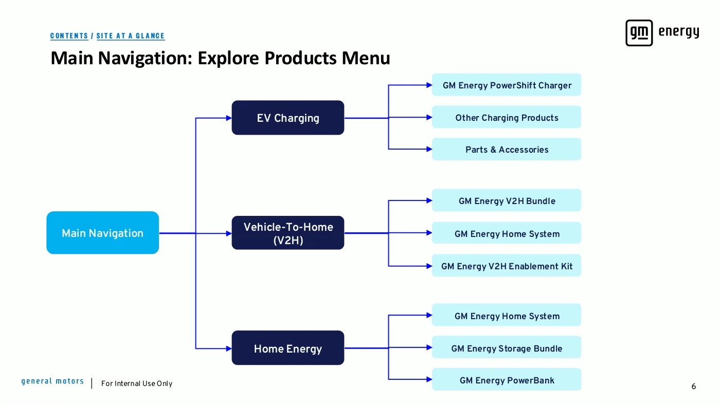
Guided flowcharts
Outcome
GM Energy went from no ecommerce presence to a launched, financed, installable product experience. What the client kept matters as much as what shipped: a service blueprint the organization still designs against, personas that have held up through three years of evidence, a two-track testing practice feeding every release, an ownership experience worked out as carefully as the sale, and a sales guide in every consultant's hands.
The storefront proved out. Within six months of checkout going live, monthly revenue had more than doubled, and average order value grew 42%, five-figure purchases completed on the site. When a fall campaign push tripled traffic and revenue fell anyway, the gap between visits and intent was the exact question the executive dashboard was built to answer, and it is why I would push to get it off hold.