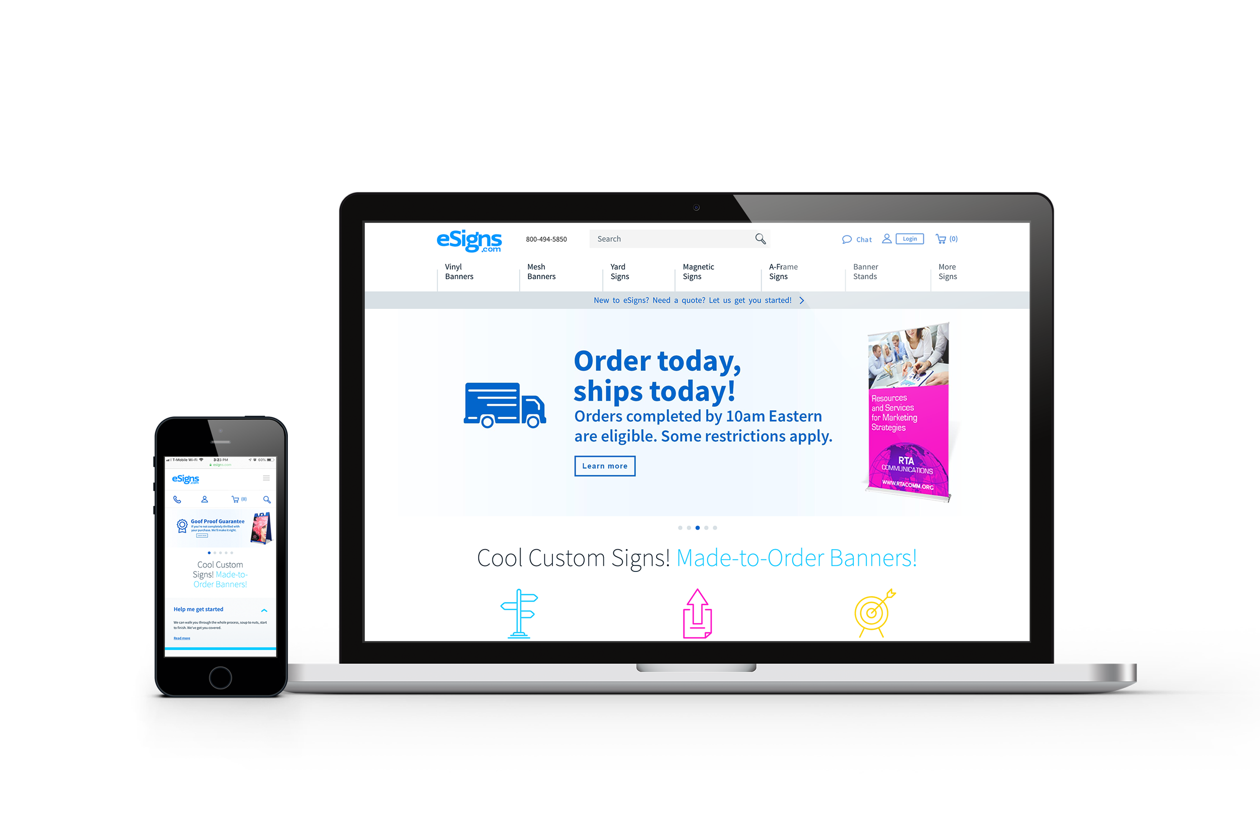
Overview
Our goal with eSigns was to create a technology and marketing platform that would position their future growth by optimizing sales conversions and customer experience. To accomplish these goals we created a backlog list of 45 items and features to refresh the brand and improve customer engagement.
Heuristics
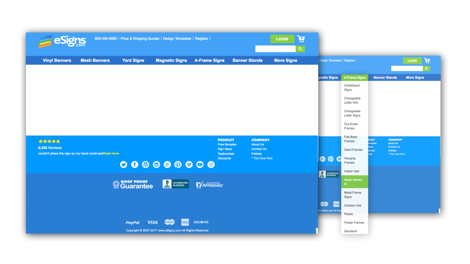
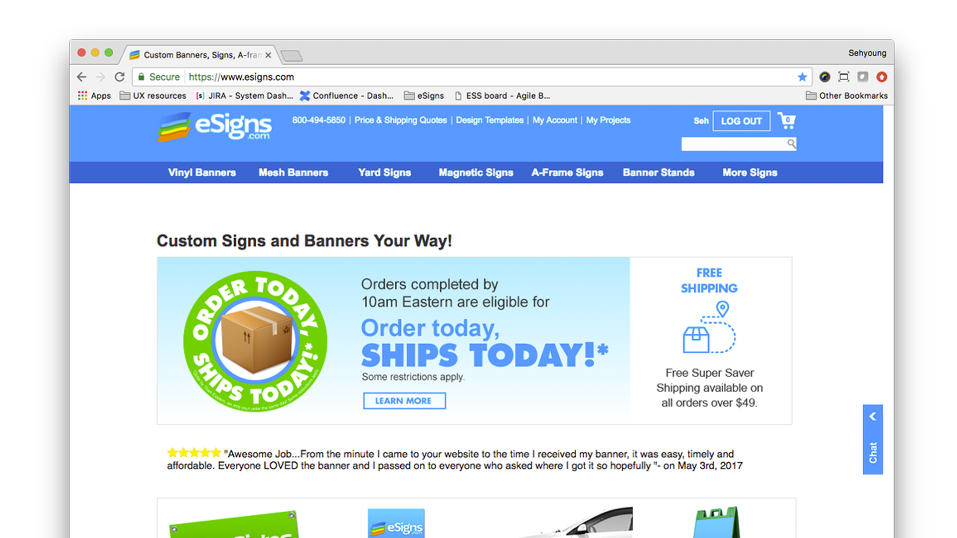
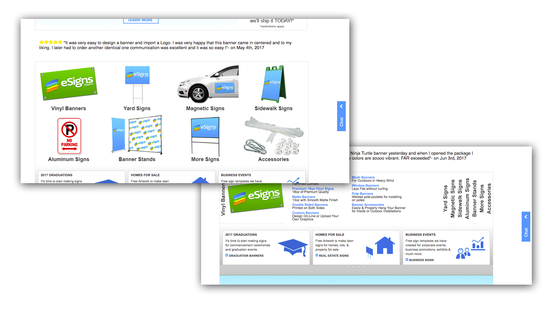
Heuristics were done on the site, revealing problems with naming conventions, improper use of color, and grouping. We learnt many of the products and information are available if you spend the time to find it. Most products they sell use naming conventions that require the user to have knowledge of the printing industry.
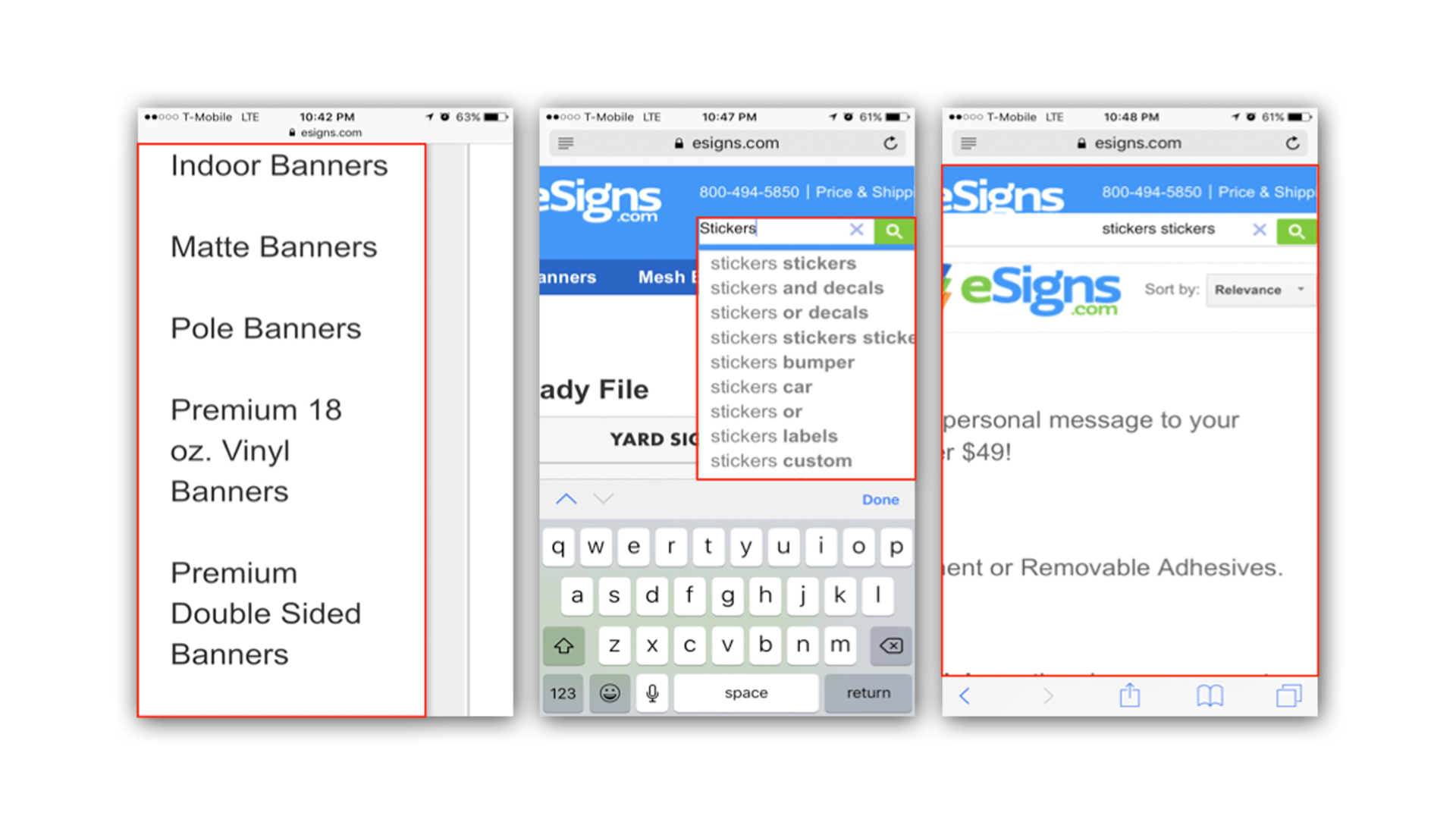
The mobile version of the site was not responsive, forcing users to zoom in and out making it difficult for users to navigate through products or even know where they are on the site.
Research
The first thing we did was find out as much as we could about the company and its customers. We interviewed customers and clients to understand their mental models from placing orders, to navigating the site, and their expectations of that service.
A workshop with eSigns team was conducted to find out what they felt was wrong with the existing site and what they felt was the direction they think they should take.
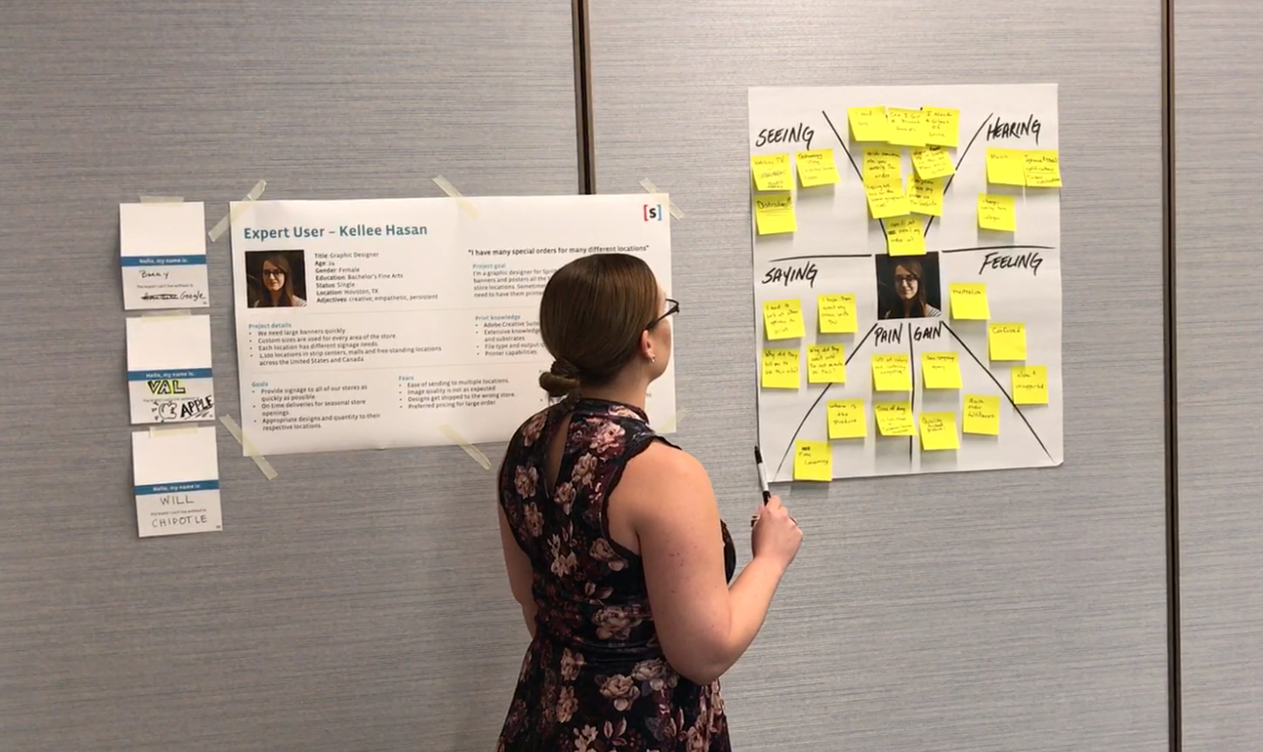
Empathy maps
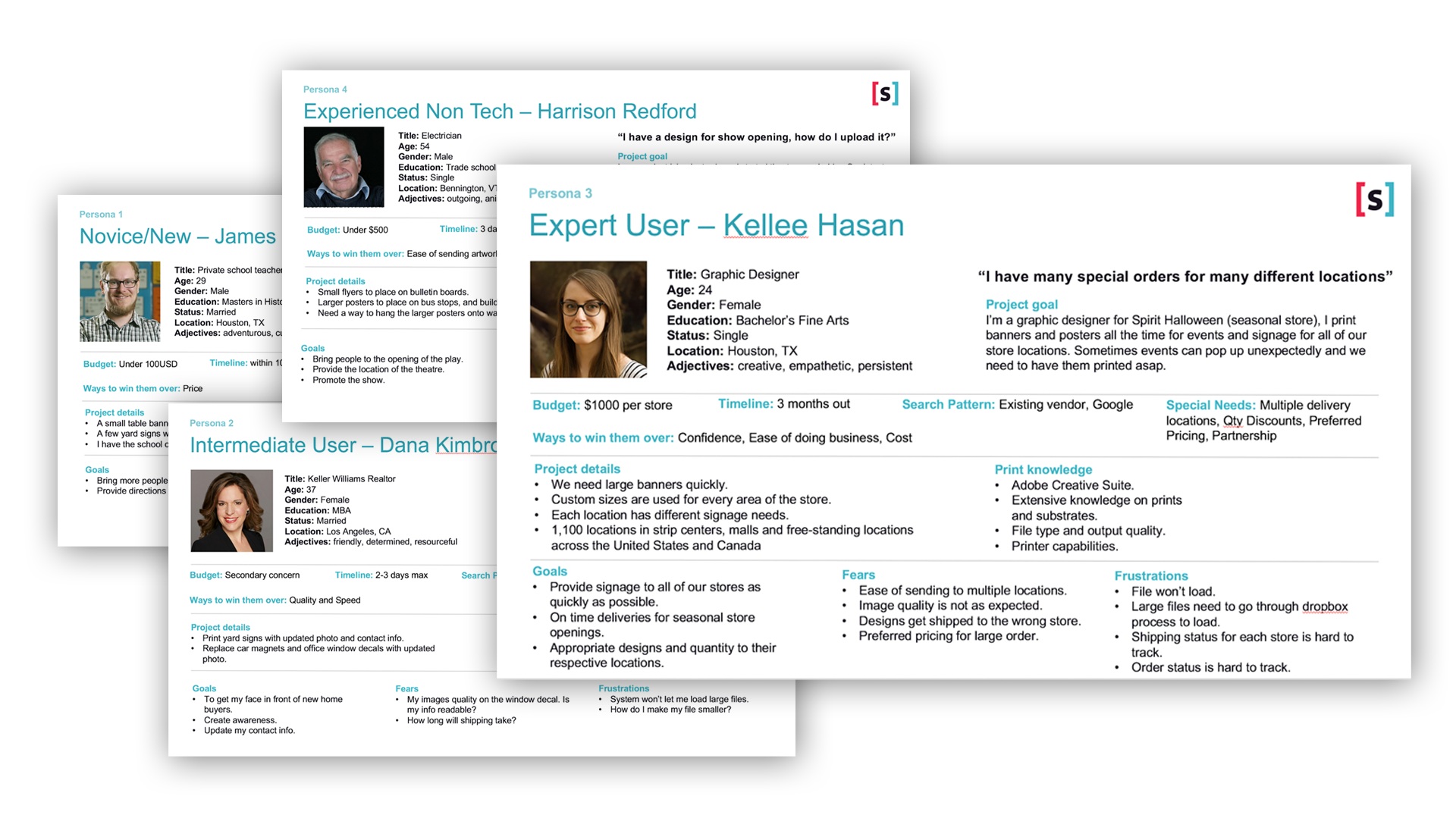
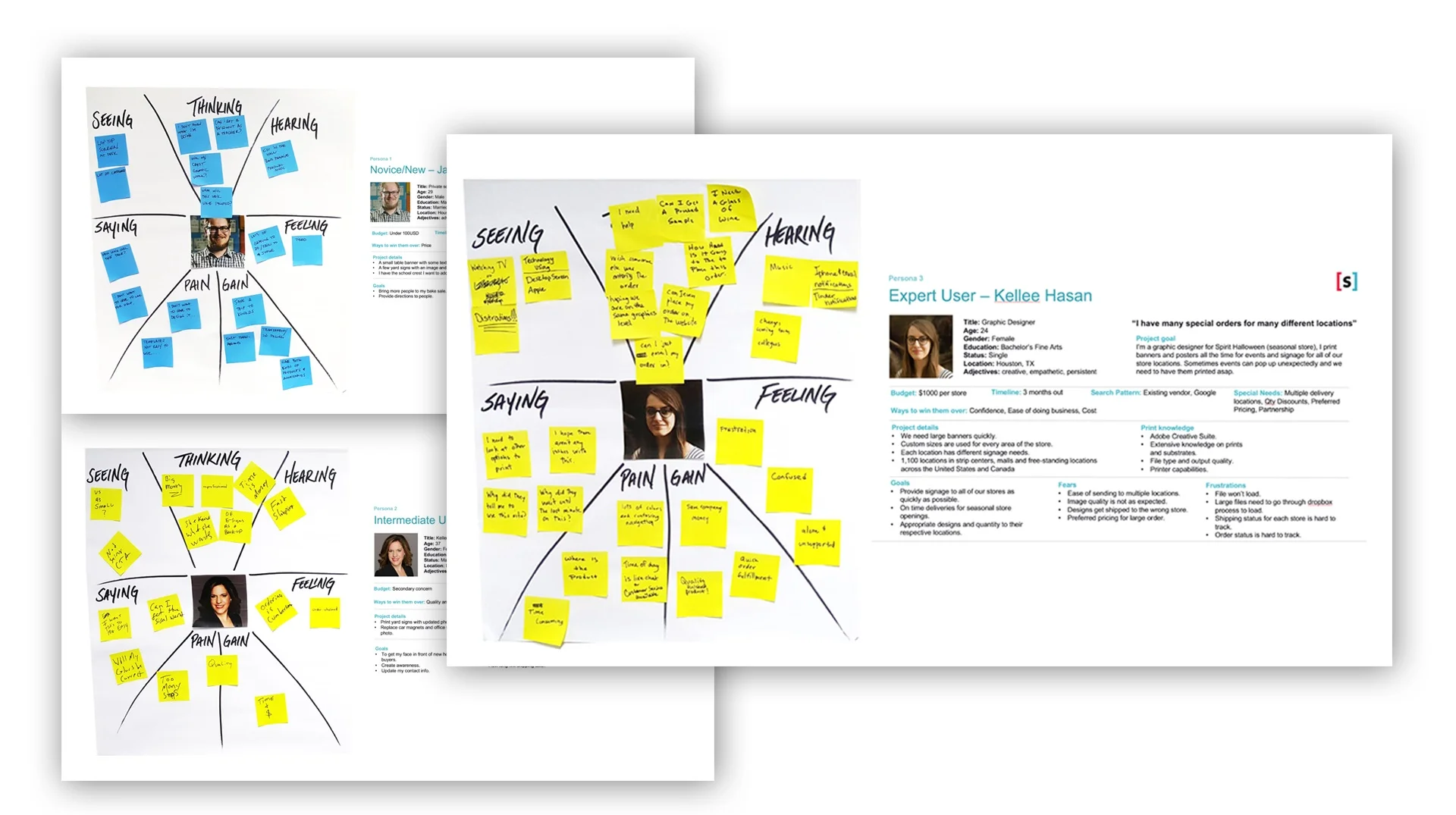
We developed personas and used those in our workshop with eSigns to gain empathy for their customers.
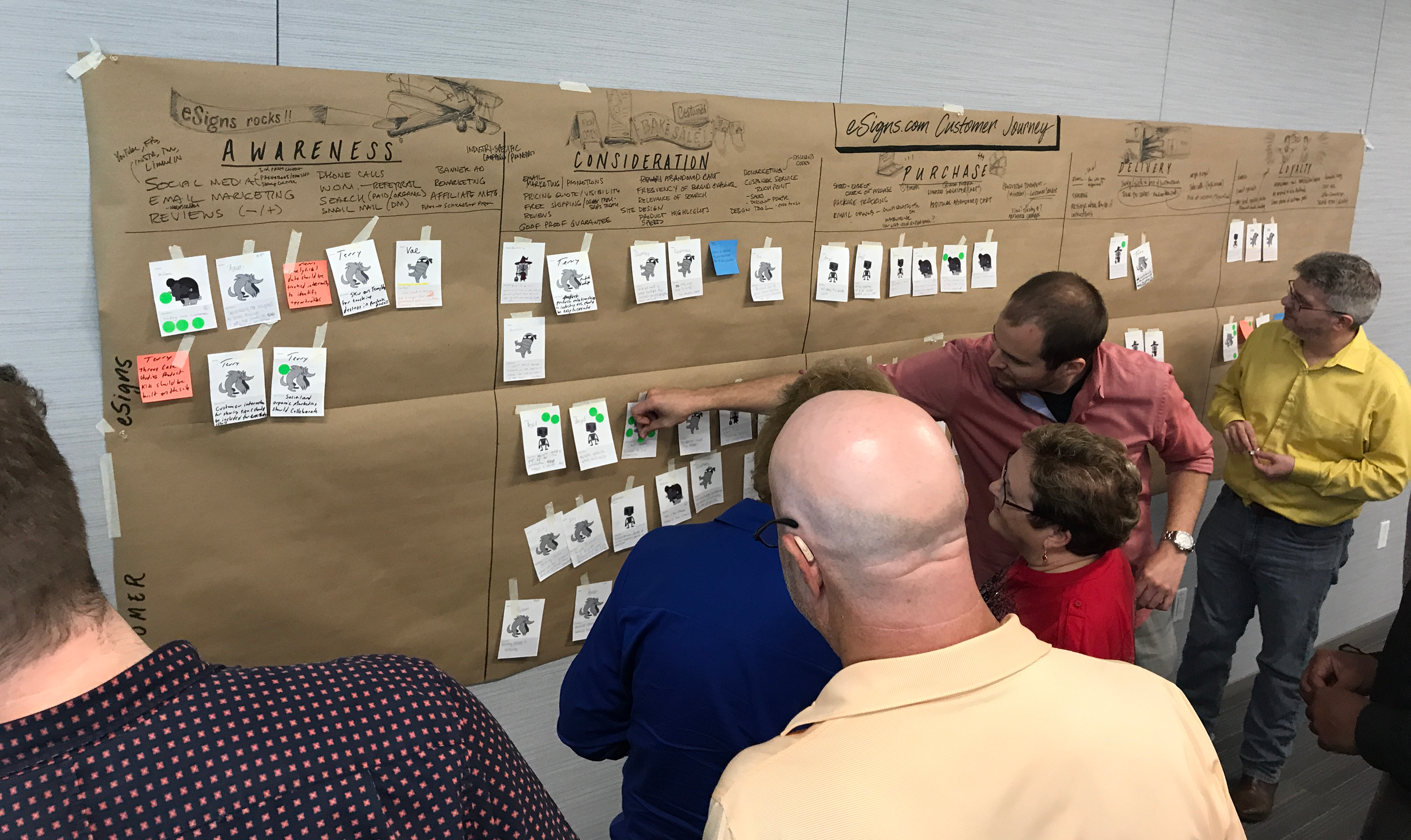
Customer Journey
Mapping the customer's journeys as a group helped our clients team members get a better understanding of where improvements can be made.
Prioritization
Based on the data we collected from our heuristics and research, we prioritized our backlog for eSigns during this first phase of deliveries. These items would provide us with quick wins to provide the most immediate value.
Navigation
We started by refreshing the sitemap. This helped users navigate the site and gave us the structure to add features to improve the shopping experience.

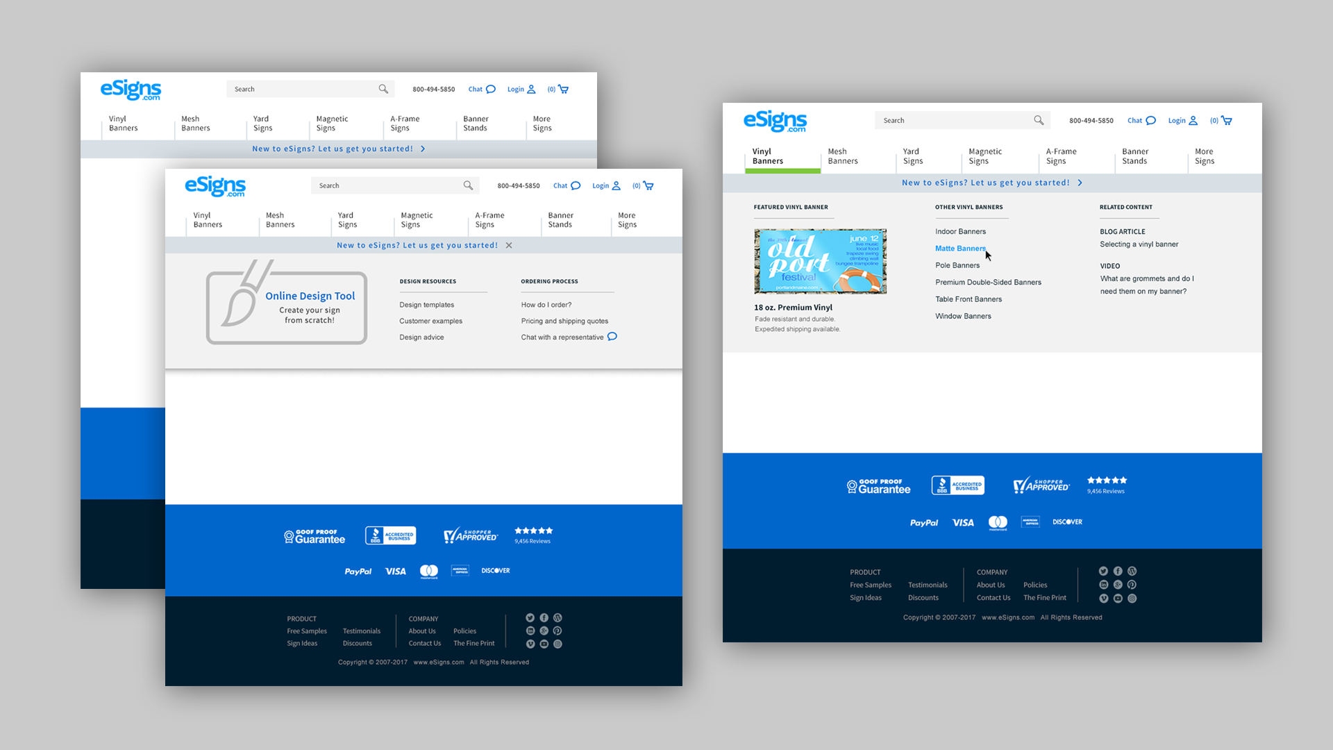
Header/Footer
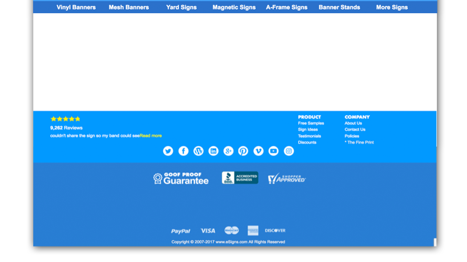
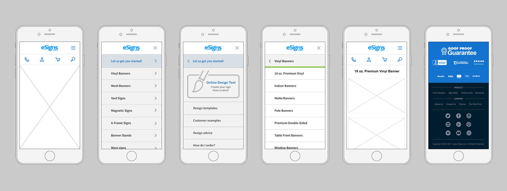
We explored ideas using best practices for UX and Information architecture to design a new header and footer for the site. Focusing on reducing visual clutter and simplifying interactions improved the sites usability.
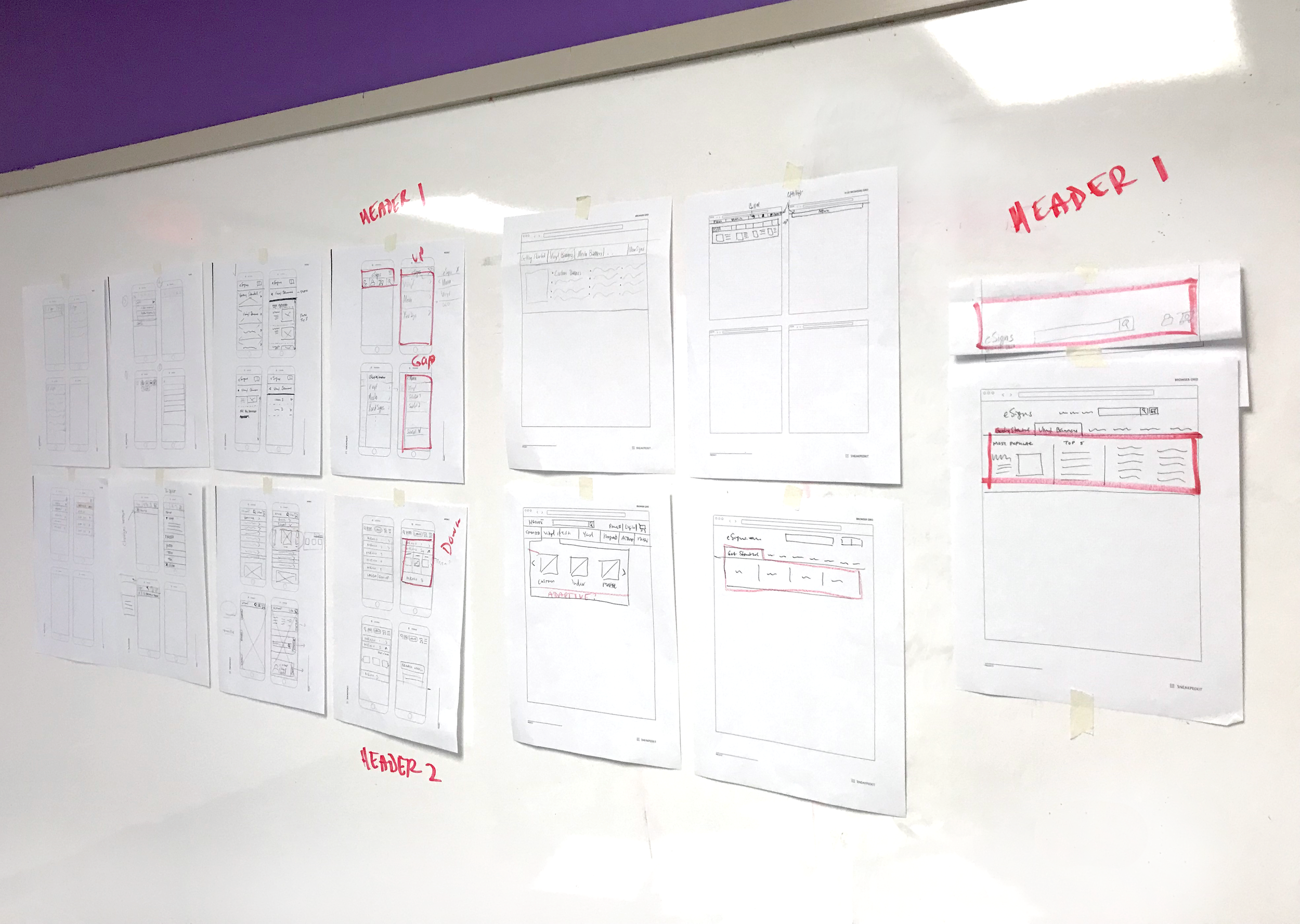
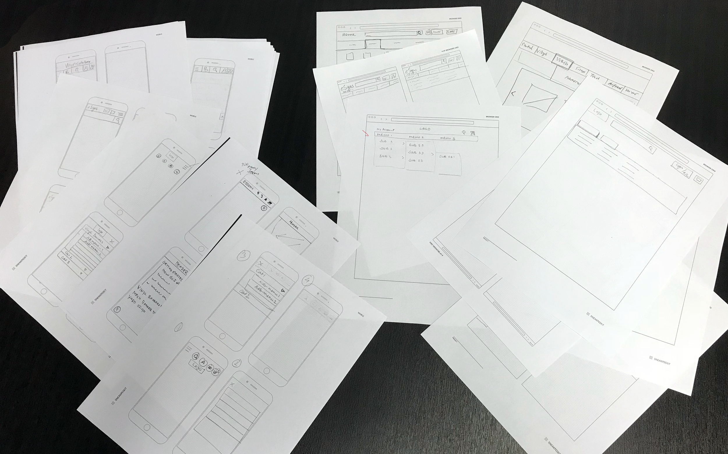
Sticky headers with auto-hide are used to reveal secondary navigation for product pages. Mega menus allow for the product previews and other suggestions to be in one area.
Homepage
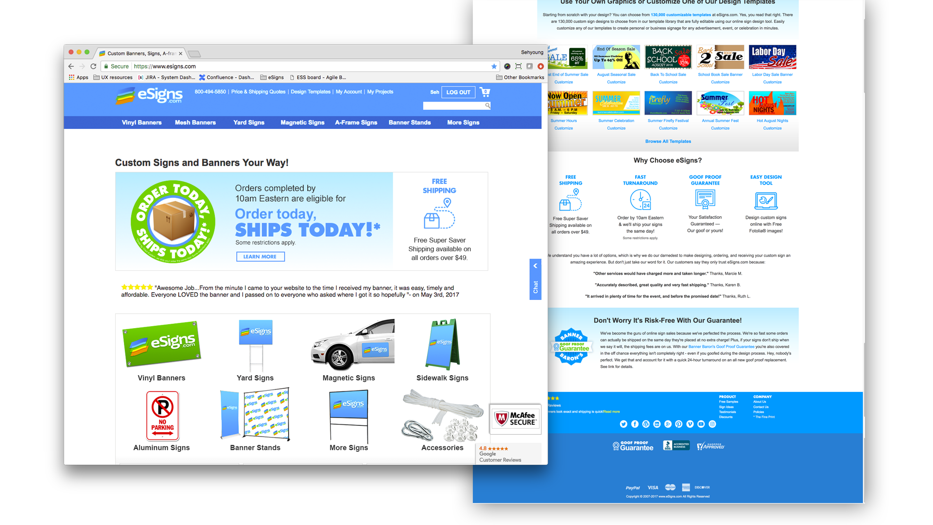
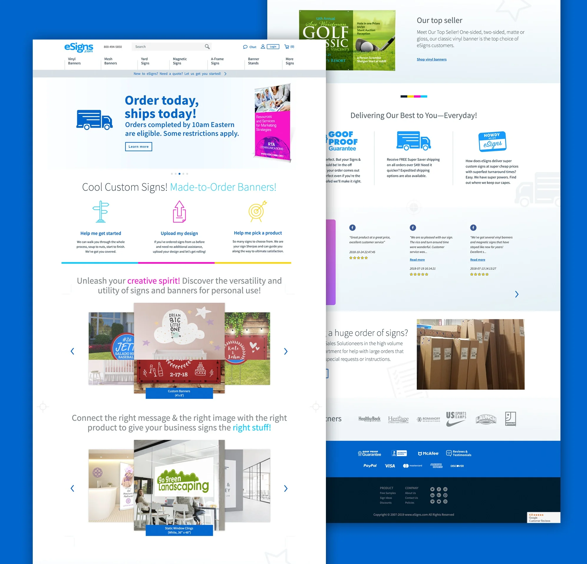
We needed to make sure that the homepage was clear to each of our personas when first landing — Who is eSigns, what they do, how they can help their particular needs, and how to get started. The homepage (along with the rest of the site) failed to establish any visual hierarchy causing cognitive overload, experienced from the clutter and disorganized content.
Content strategy for the homepage and throughout the site is focused on 4 key areas in order to position eSigns as the customer focused everyday hero:
- Time and cost savings
- Provide assistance for current and future audiences
- Communicate that eSigns is a partner who can save the day
- Elevate perceived quality without perception of higher cost
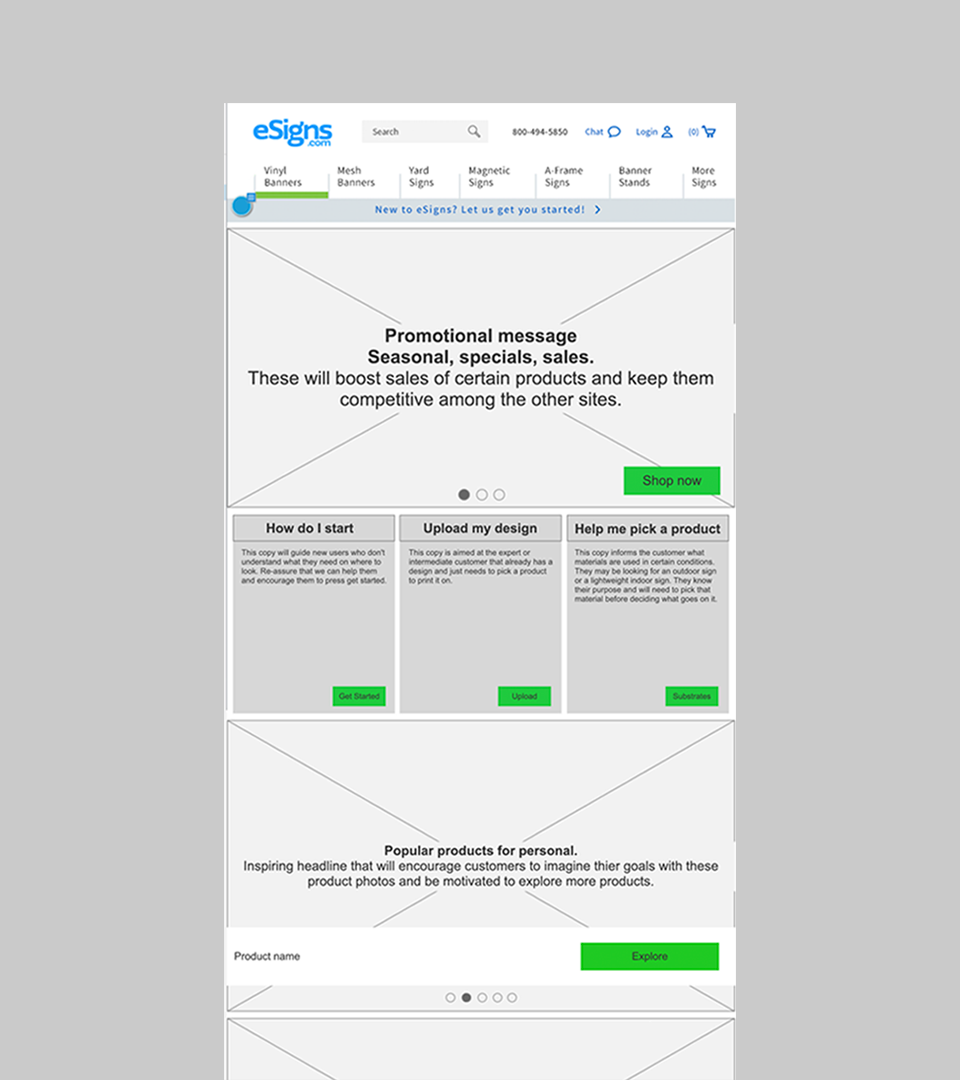
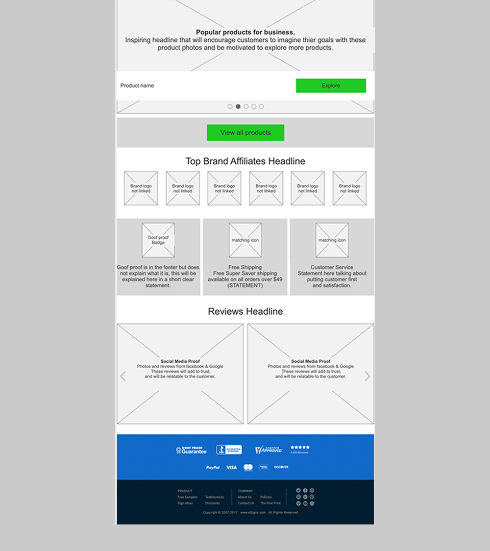
Final homepage design
Buying process
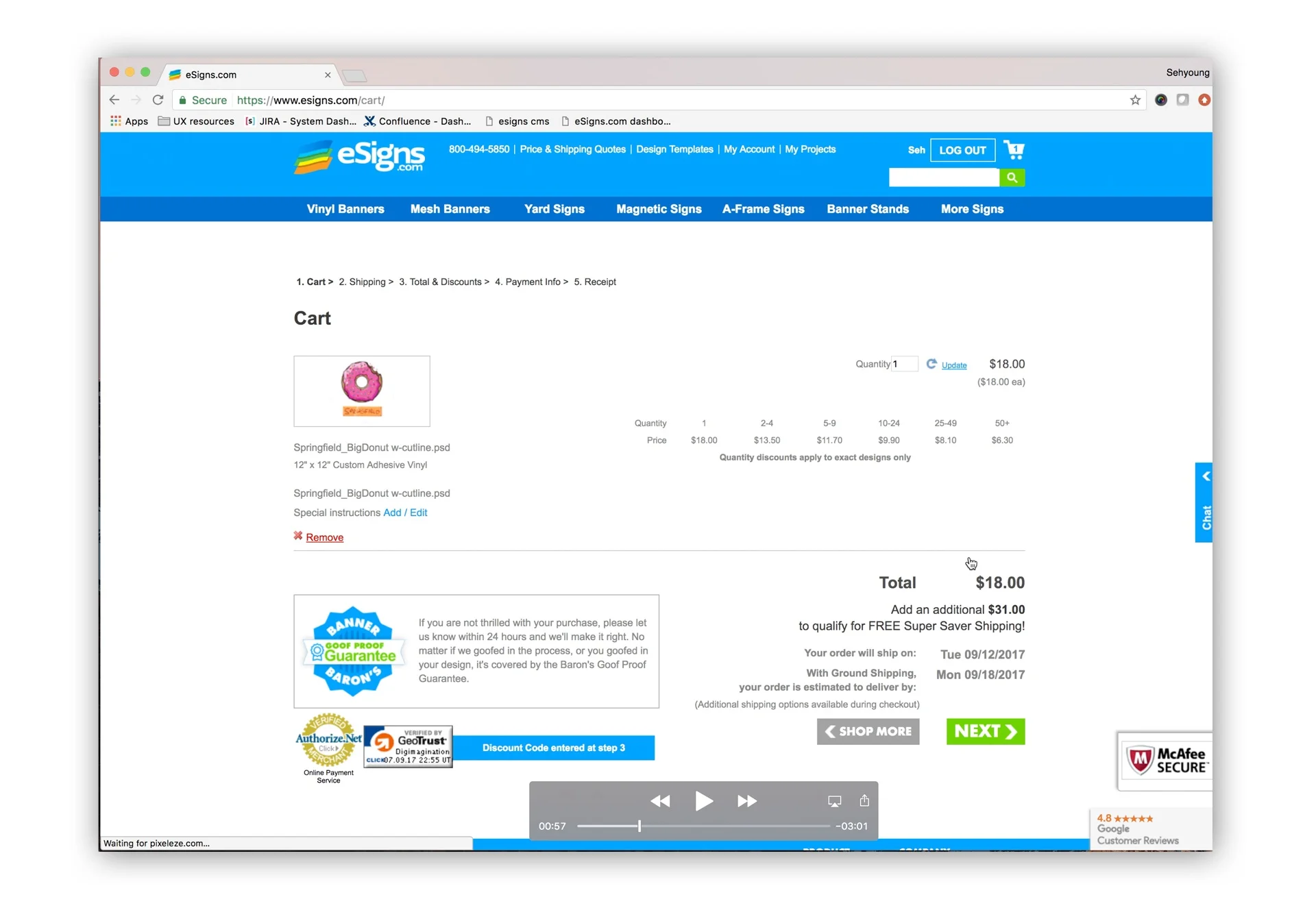
Previous cart page
The cart page was scattered, messy and distracting, it takes the customer away from the products without a way to continue shopping.
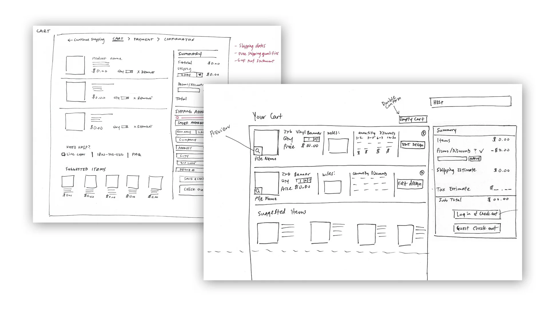
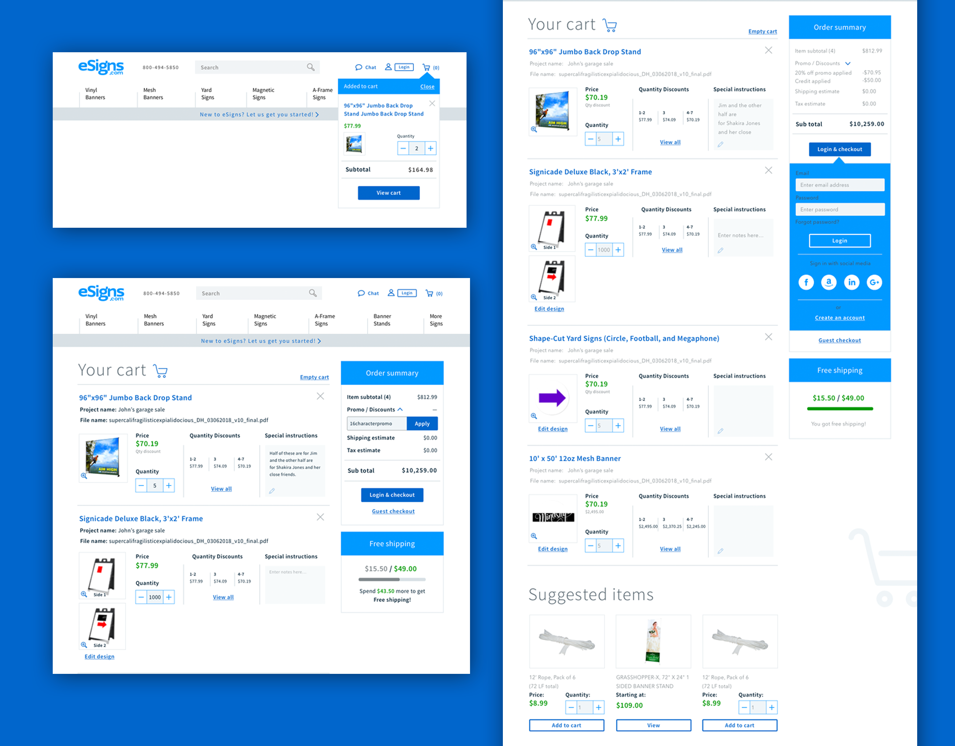
New cart page
The cart page needed to be clean and free of distractions. Line items were standardized and options were added to make adjustments to your cart without leaving it.
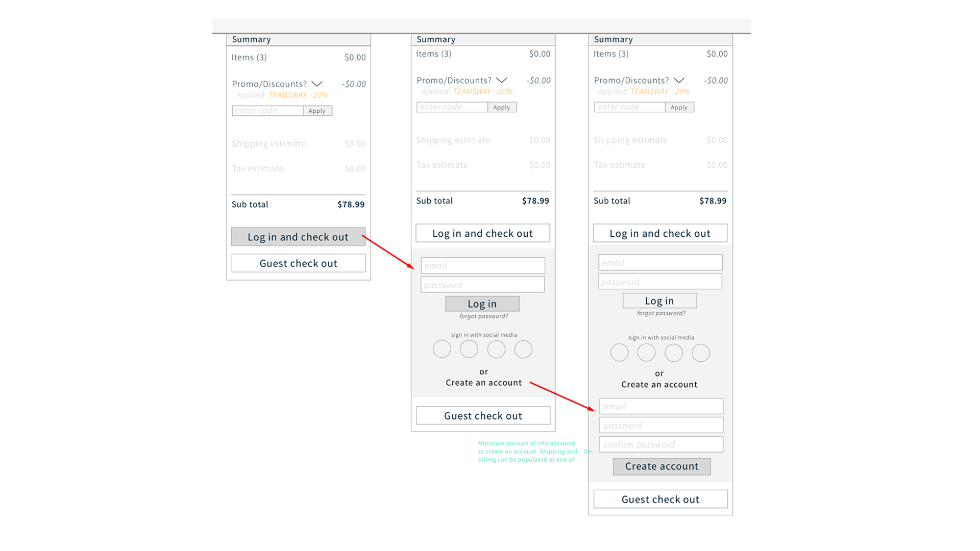
Summary column
The shopping cart features a summary column that lets you preview the price, add coupon codes and log in without leaving the screen.
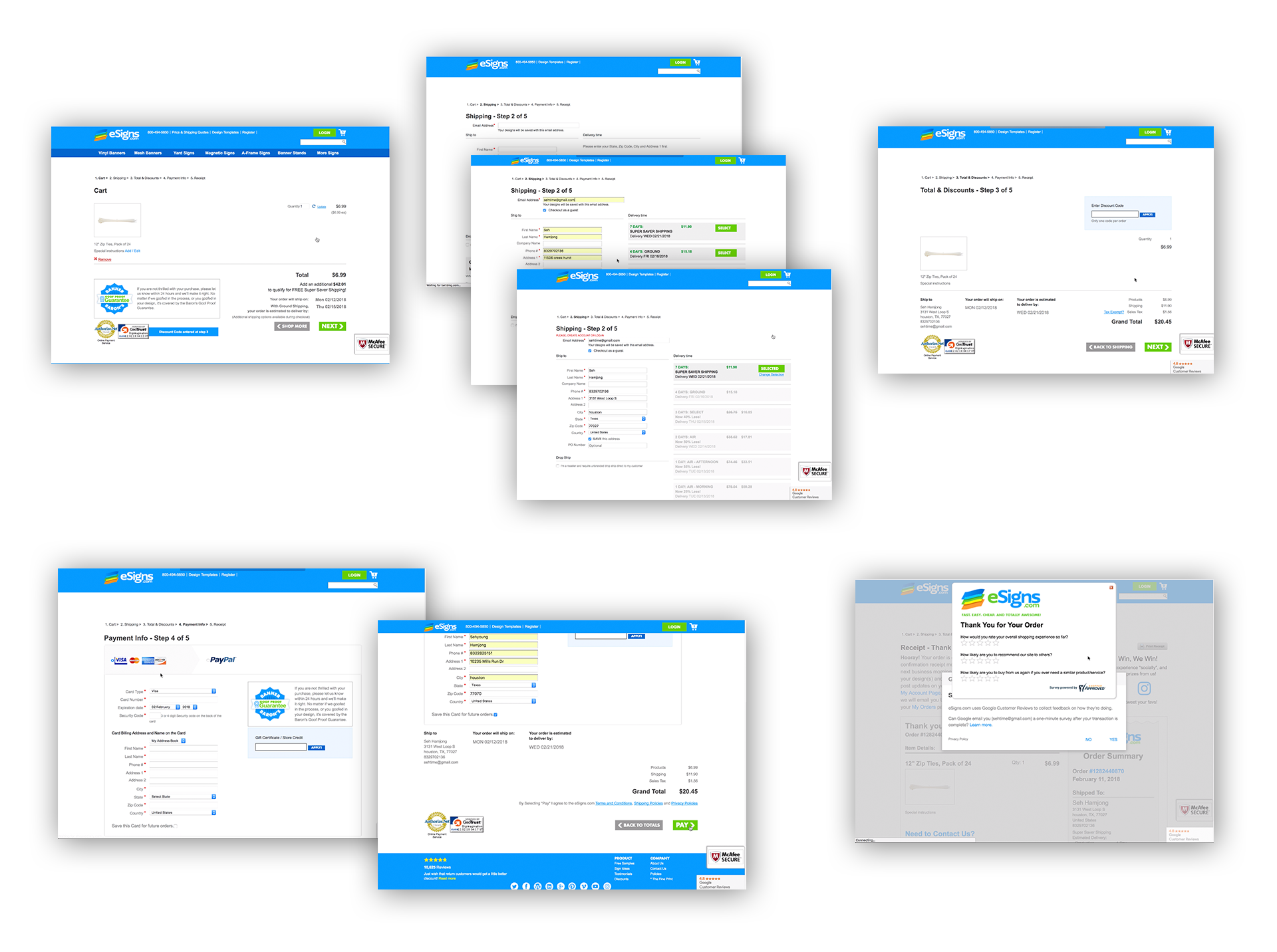
Checkout steps
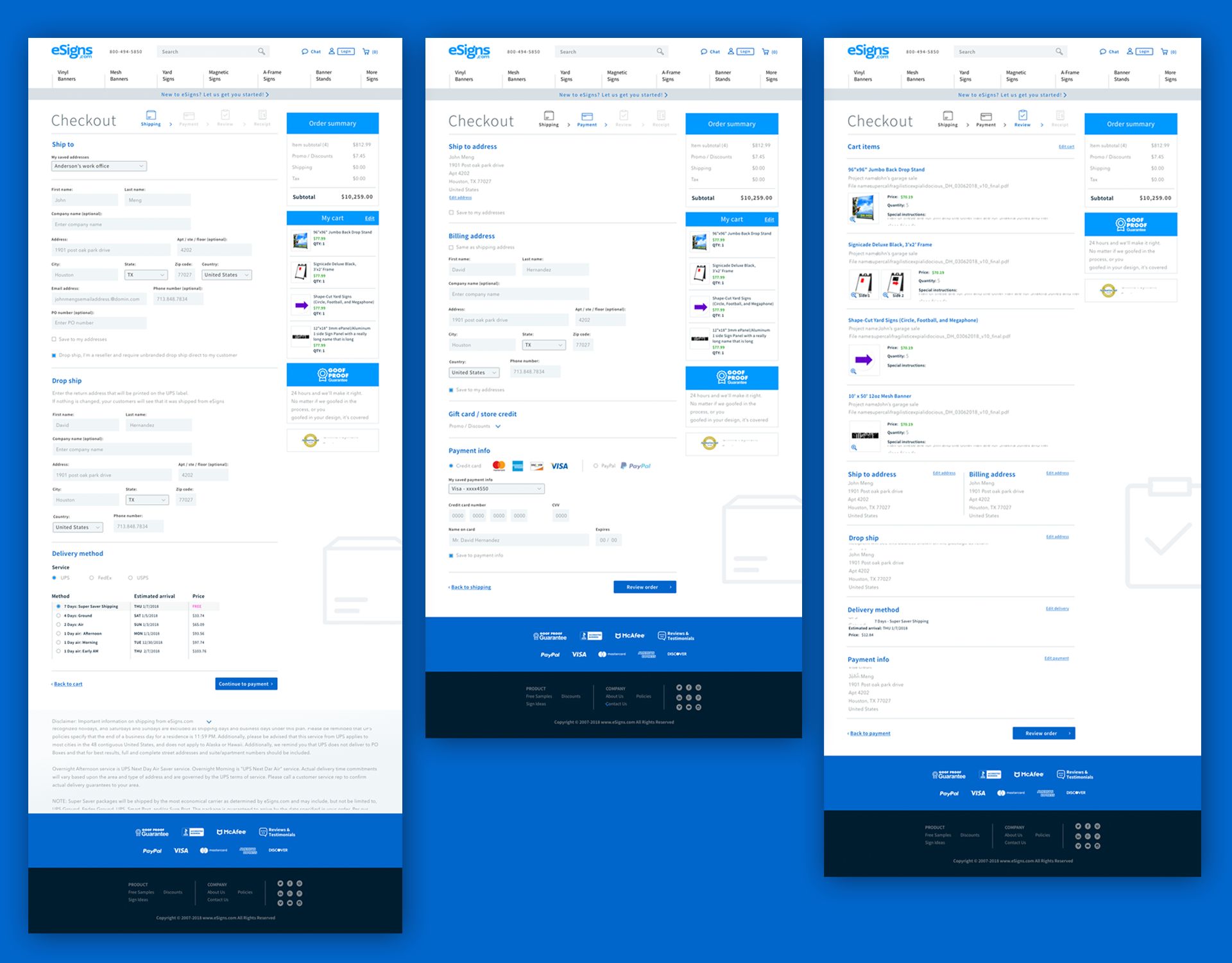
The checkout process is a long and frustrating process. There are 5 steps to the checkout process but the actual number of screens the user sees is much more.
Address fields
In the new designs, ship to and bill to sections have been organized and text fields are clean and easy to follow. All the discounts and coupon codes are on the summary column to review. Payment methods are on the same screen and no longer take you to another page.
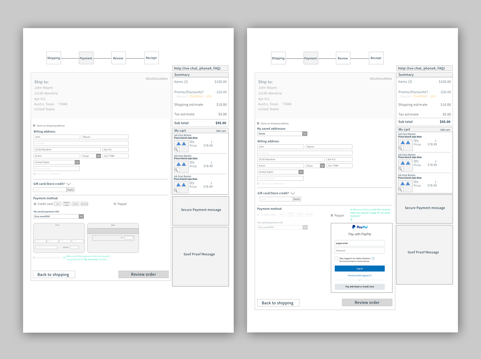
The new checkout process has been cut down to 3 screens by combining steps and refining these interactions to save time and space on the page. This keeps people focused on making the purchase and reduces abandoned carts.
Future Information architecture and features
In anticipation of the next phase in design, we ran a GV sprint to quickly explore ideas for the future state of eSign's customer experience. During this week, features and customer journeys were thought out and presented to give the direction of their new site.
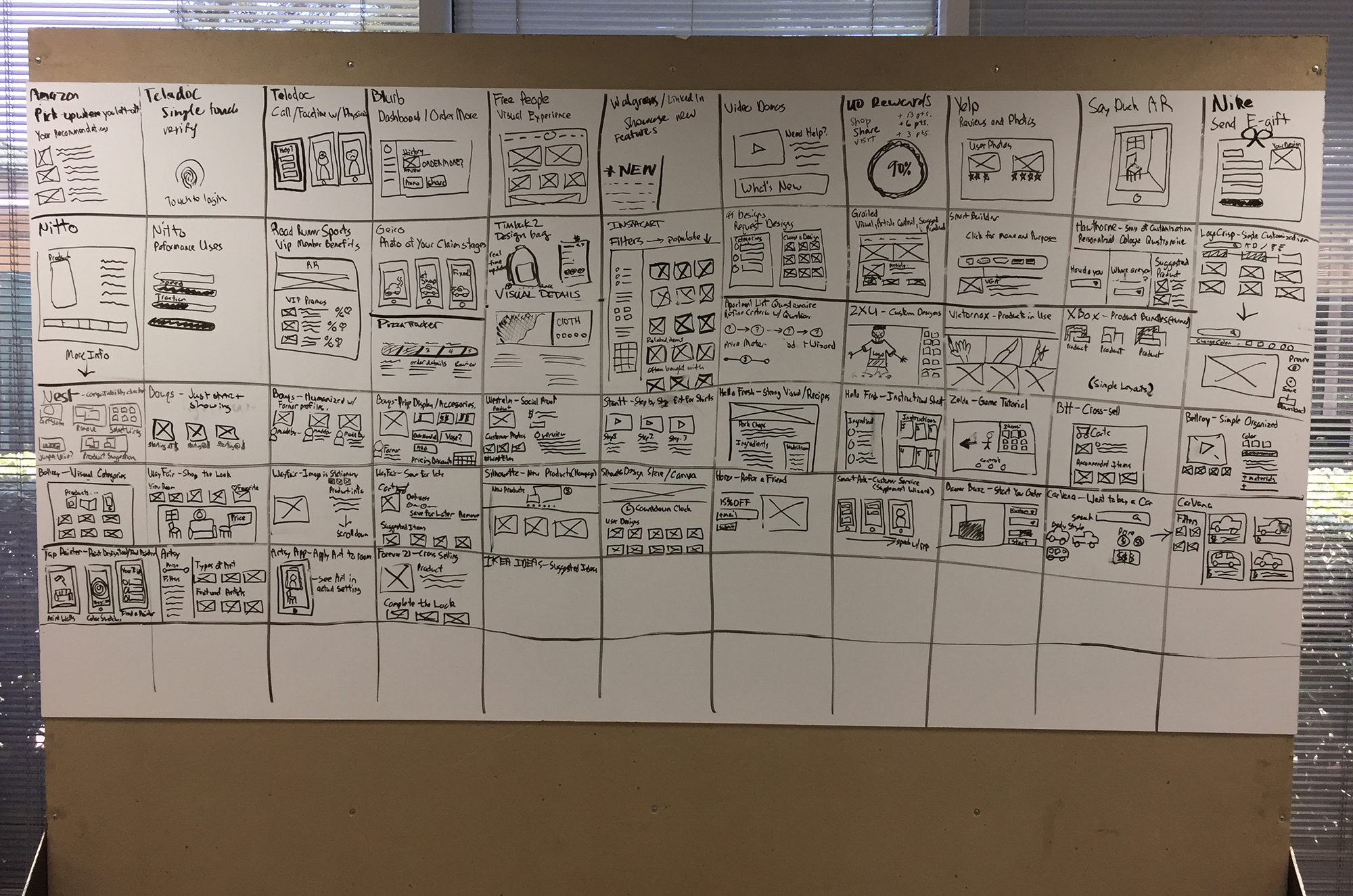
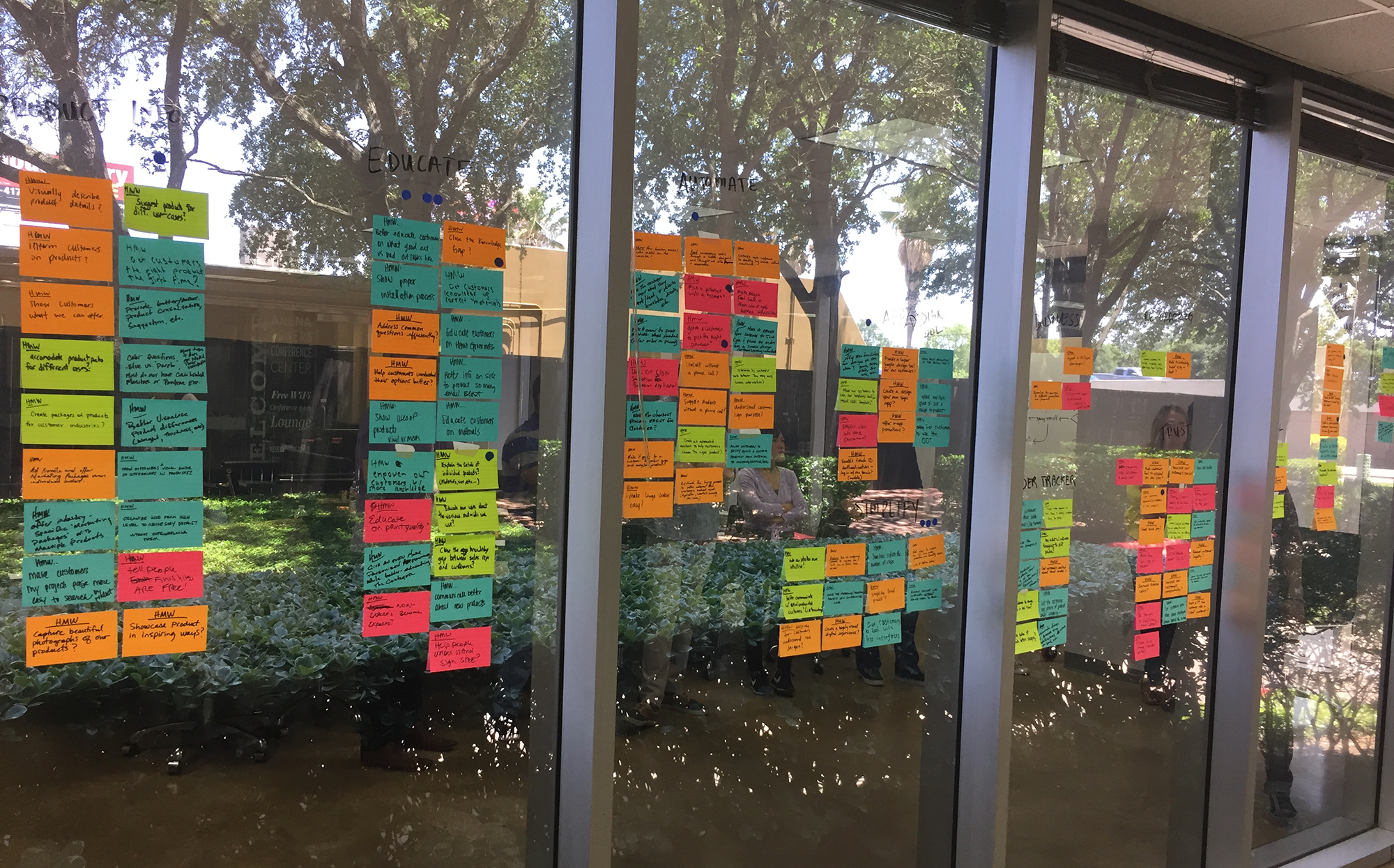
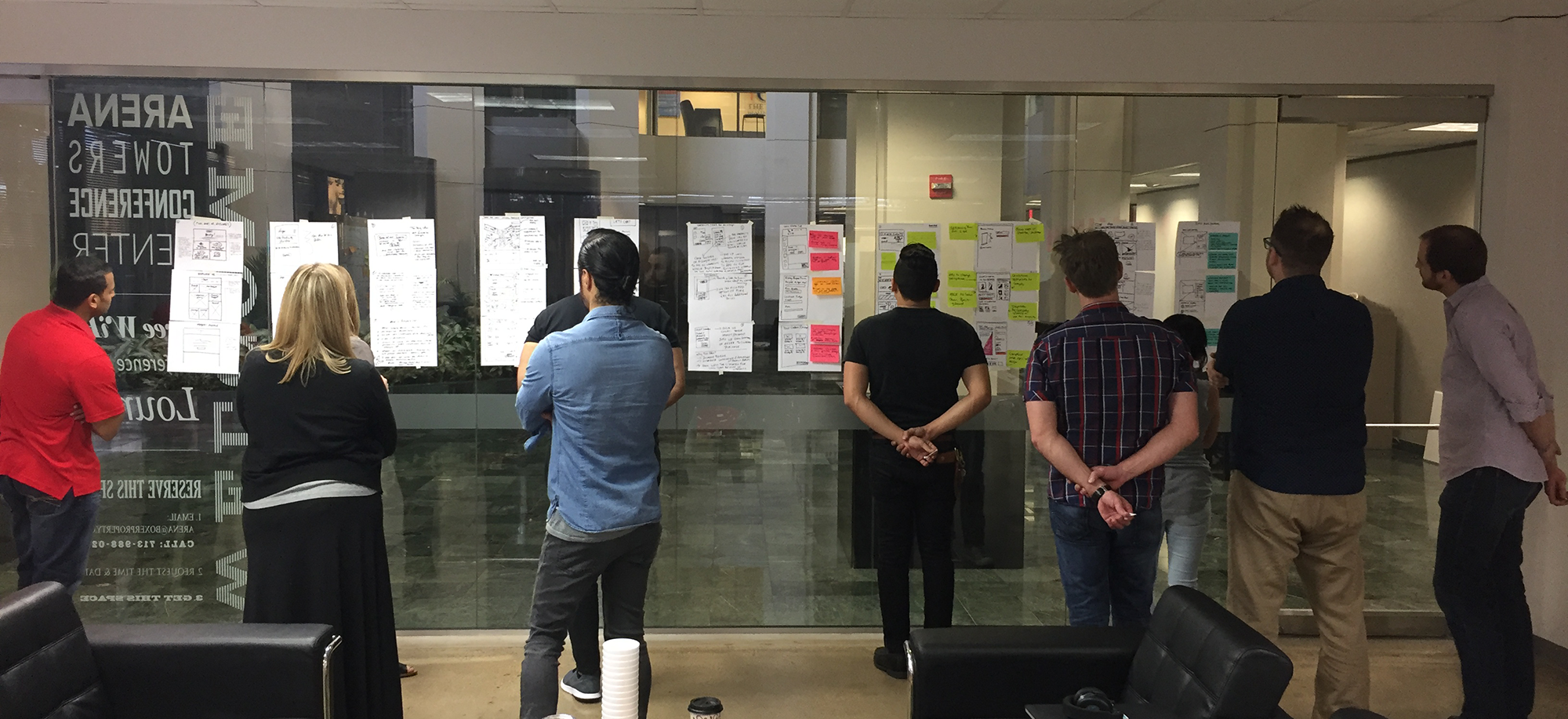
We used the results from this workshop as a starting point to prototype two experiences to test with users and get feedback on improvements. This data will also be used to identify other areas that eSigns can test and improve — giving us a backlog for phase two of the project.